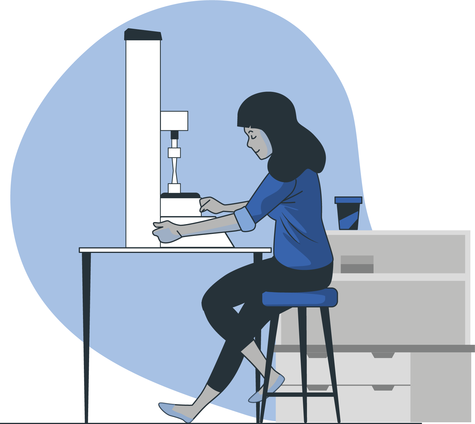
Project: Digital paint and Digital illustration portfolio
Skills: Design, Drawing, painting, composition, colour theory, perspective and figure drawing.
Style: Painterly and Realistic with different levels of stylisation.
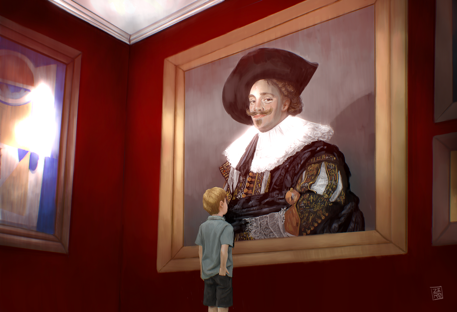
Right: National Museum
My design journal plays a huge part of my process. I do all my planning and exploration in it. This was part of a series I did featuring museums. The painting the boy is looking at is a replica based on 'The Laughing Cavalier'. It is considered to the the height of Baroque art. I rendered it quickly so isn't exact but good enough.
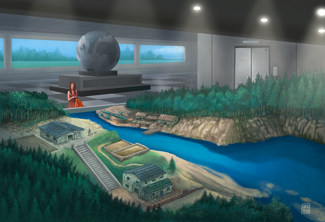
Left: The Diorama
Part of a series on Museums and other institutions of learning. The composition draws the eye in along the revert the woman. The palette is contrastive red and green. So that aspect further adds to her being the focal point. The globe behind her stops the eye from going too deep into the space and pushes it back towards the elevator and line of trees.
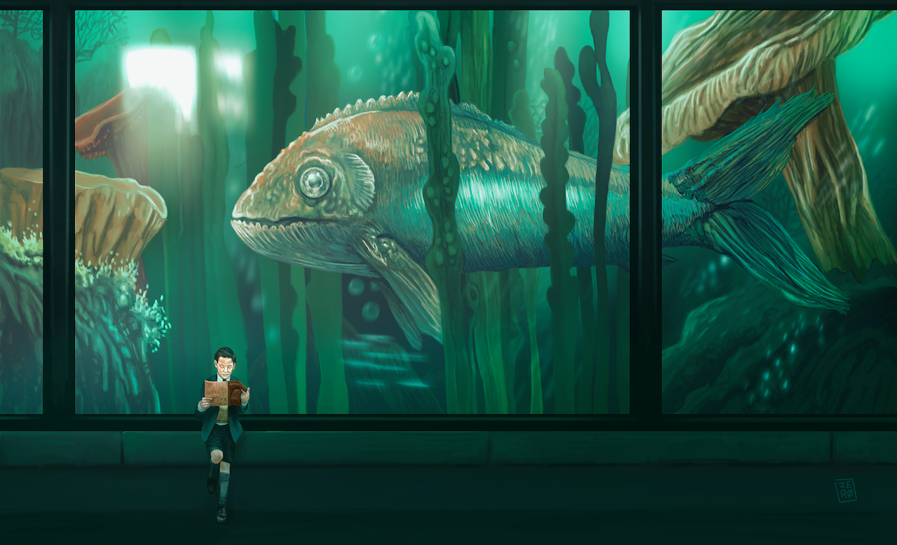
Right: Amazing Stories for Boys
This is part of a series. An aquarium always is a place of intrigue and wonder. The giant Jurassic era-like fish glides past without the boy noticing it. The boy is reading a magazine called 'Amazing Stories'. The process for this one was interesting, to get the light right I started with very bright and light colours to build up light depth.
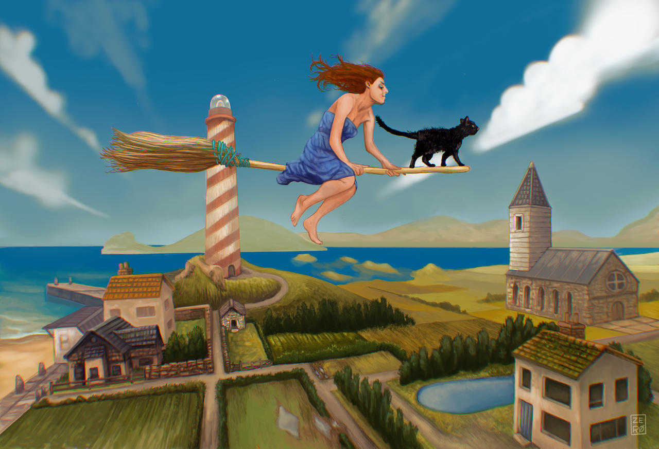
Right: Local Witch
Most designers, artists or motion graphic professionals have heard of Miyazaki. This is a personal tribute to 'Kiki'. Not as cute as the Anime style beautifully portrayed in the animated film. I wanted to go for a less stylised look, towards realistic fantasy.
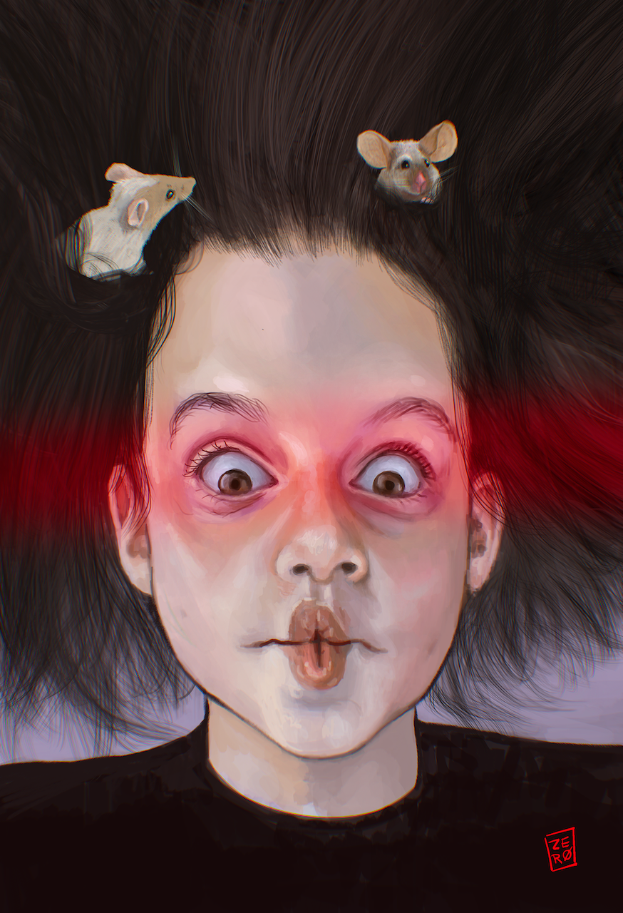
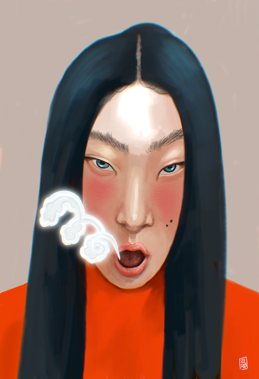
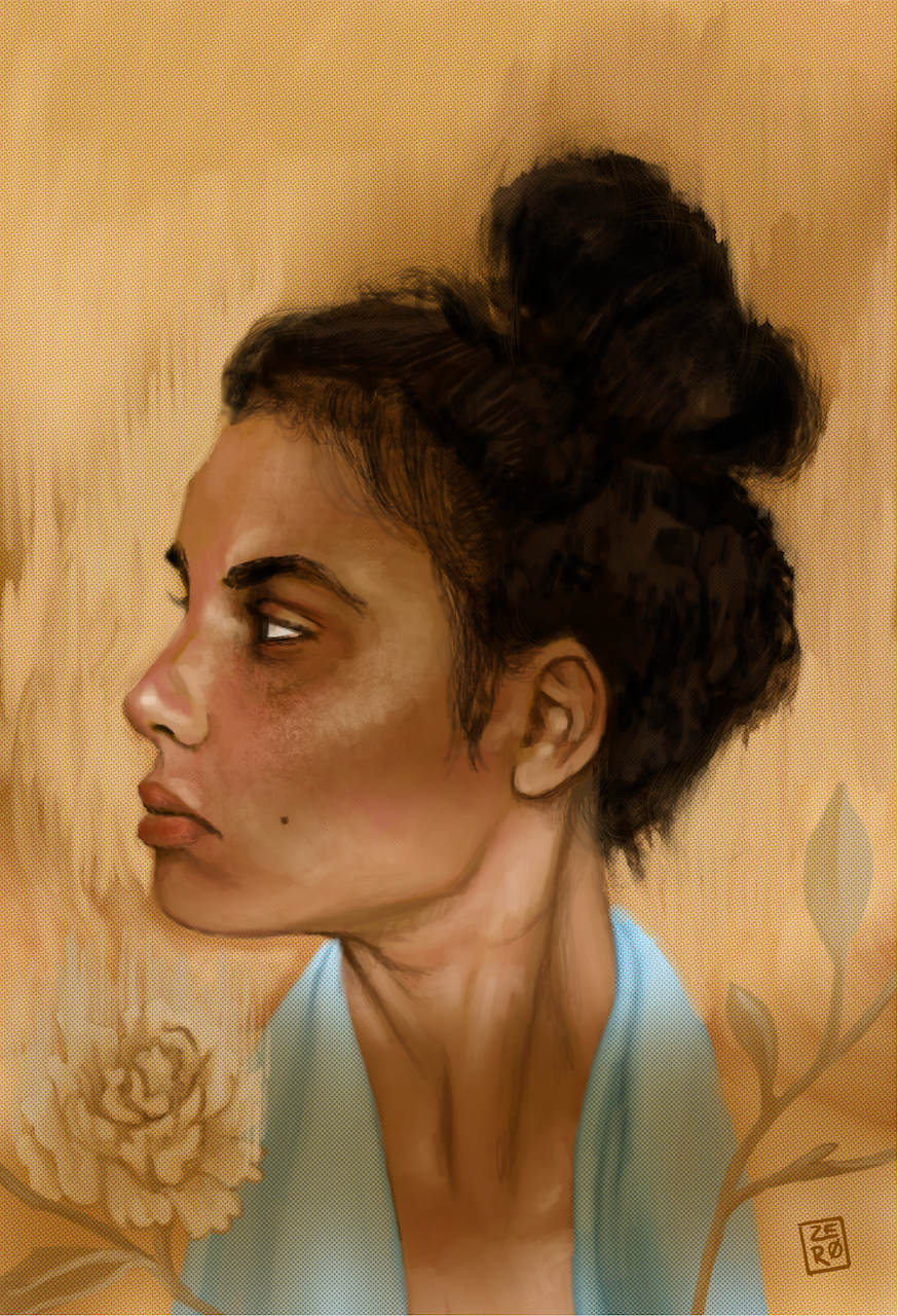
Below: Portraits
These are a series of portraits from a collection of prints. Each one has a slightly different approach to style, artist marks, colour and content.
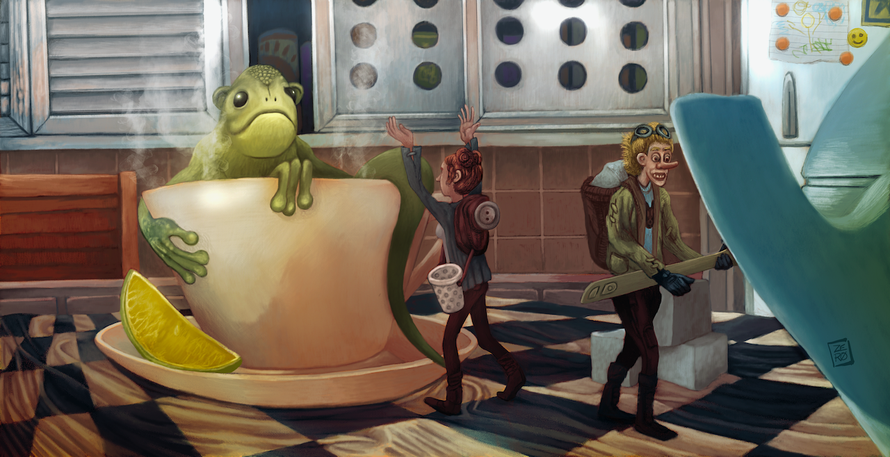
Right: Small people
I like the environment of the image on the right. It's meant to be quirky and funny. The humour of the lizard-like monkey in the tea cup makes me smile. I first did a value study before painting over it in colour.
Below: Older work
These are some of my older works. Ranging from 2010 to 2015.
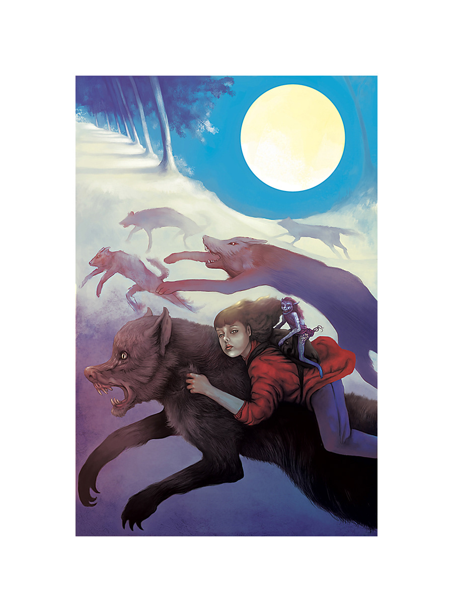
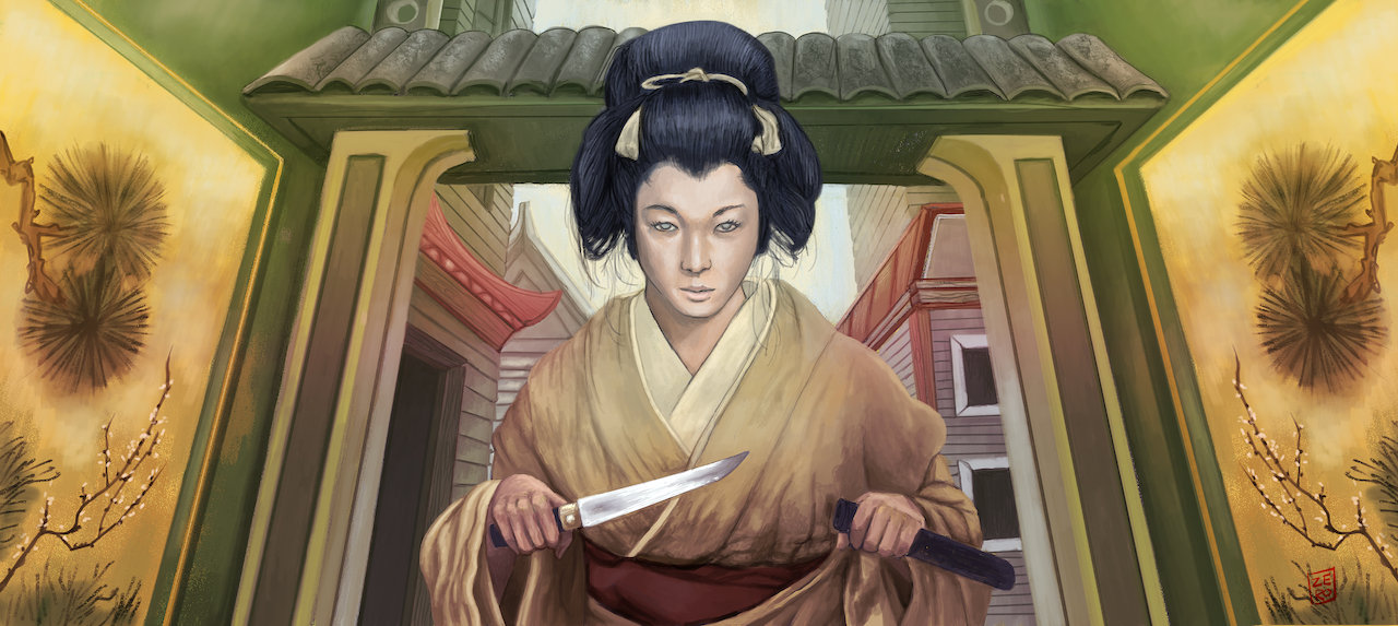
Above: Revenge
This is the second of two variants. It's a strong central focused composition. The woman dominates the field of view. It's a 1 point perspective image. Everything either reinforces the character or is foil to it.
Project: Digital illustration portfolio - Pen and Ink styles
Skills: Design, Drawing, painting, composition, colour theory, perspective and figure drawing, Pencil and inking colouring and abstraction.
Style: Pen and ink, Cartoonist, watercolour, graphic novel illustration styles and comic book.
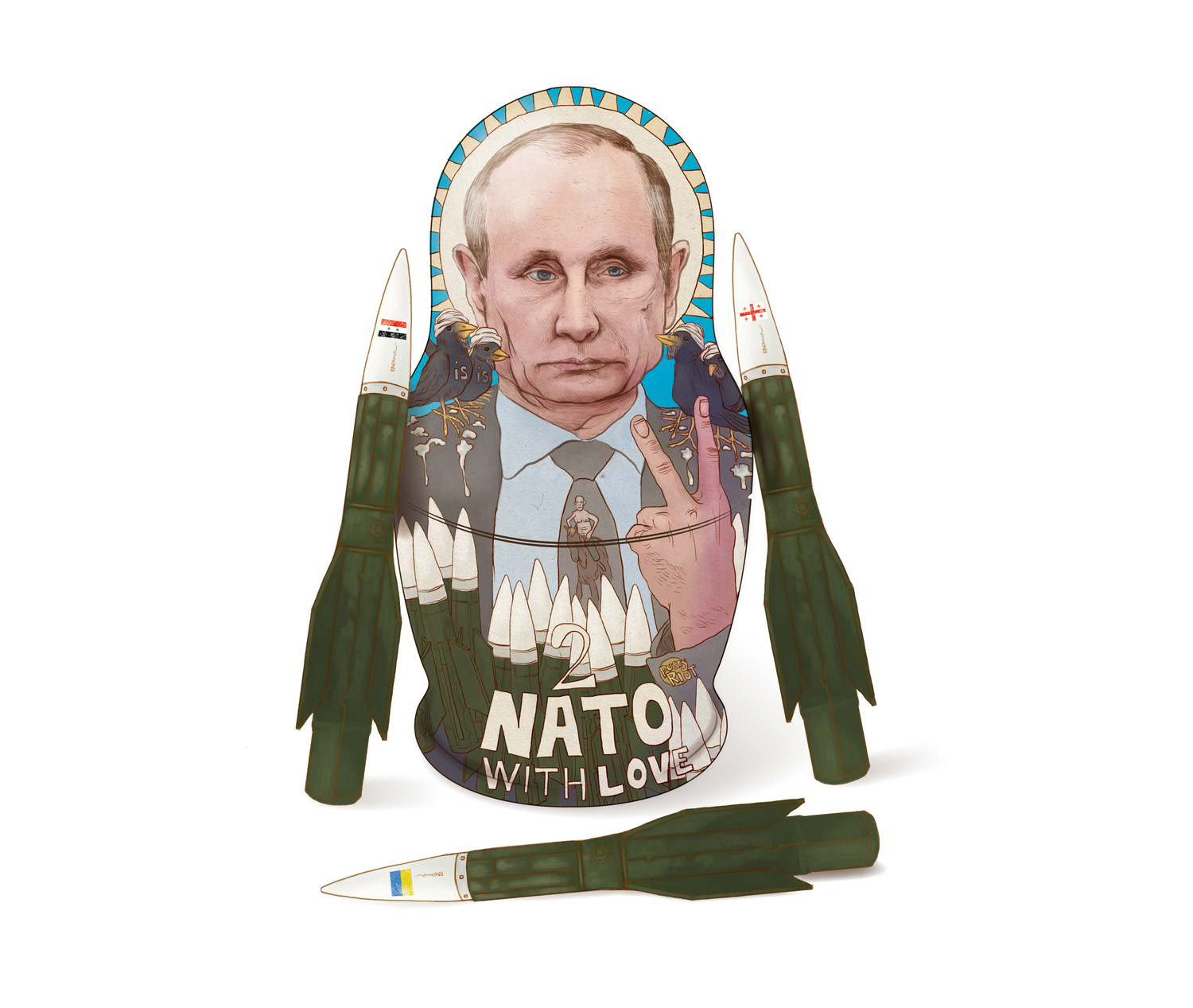
Right: To NATO with love
This illustration embodies editorial illustrations often found in news related magazines such as The Economist or The New Yorker. It was done to illustrate the disdain Putin was showing to established rules in the West.
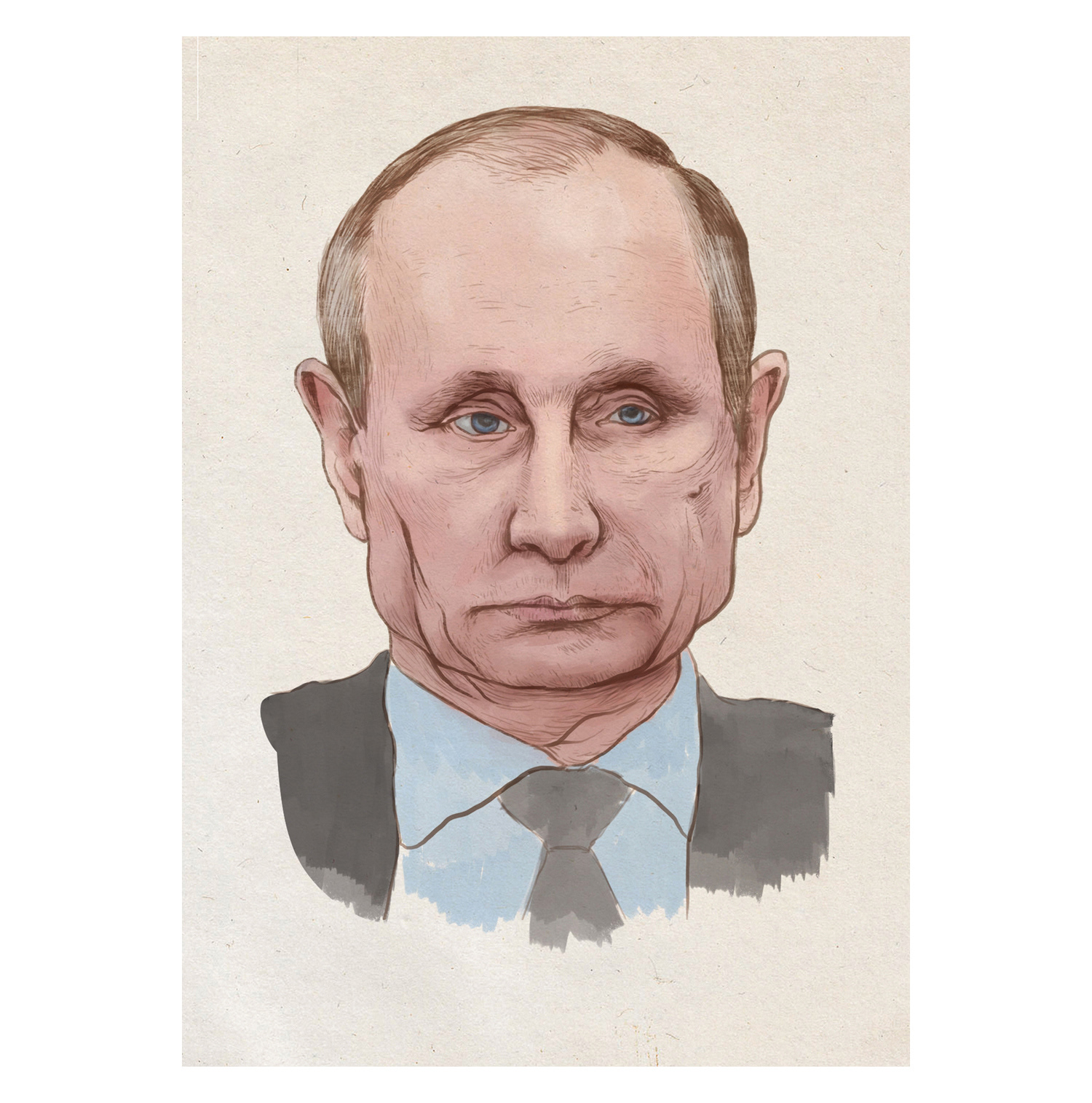
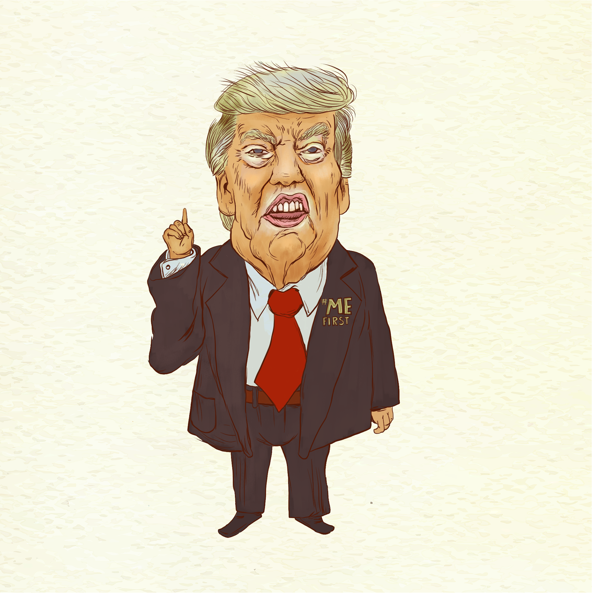
Right: Putin and Trump
Self explanatory, illustrations of the 45th American president and Putin.
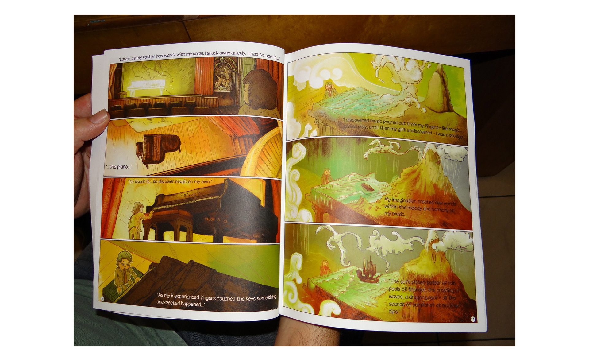
Left: The Piano
The pages on the left are from 'The Piano'. A graphic novel/comic I published. The style is very different to my other work - towards the naive. I really loved the colour treatment in the book.
The story is about a boy who against his own father's disapproval finds the gift of music.
Project: Vector type illustration portfolio
Skills: Stylisation, conceptual ideation, abstraction, drawing, vector based drawing and other software skills.
Style: Shape and vector
Right: A collection of Vector based illustrations.
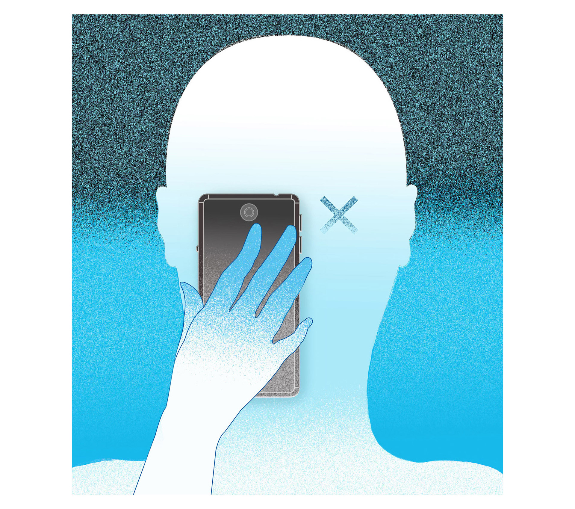
Images can quickly convey a message to support other content. They can be beautiful or hard hitting. Images should have a voice and add a lot of value. A purely decorative image is sometimes a failure of the imagination.
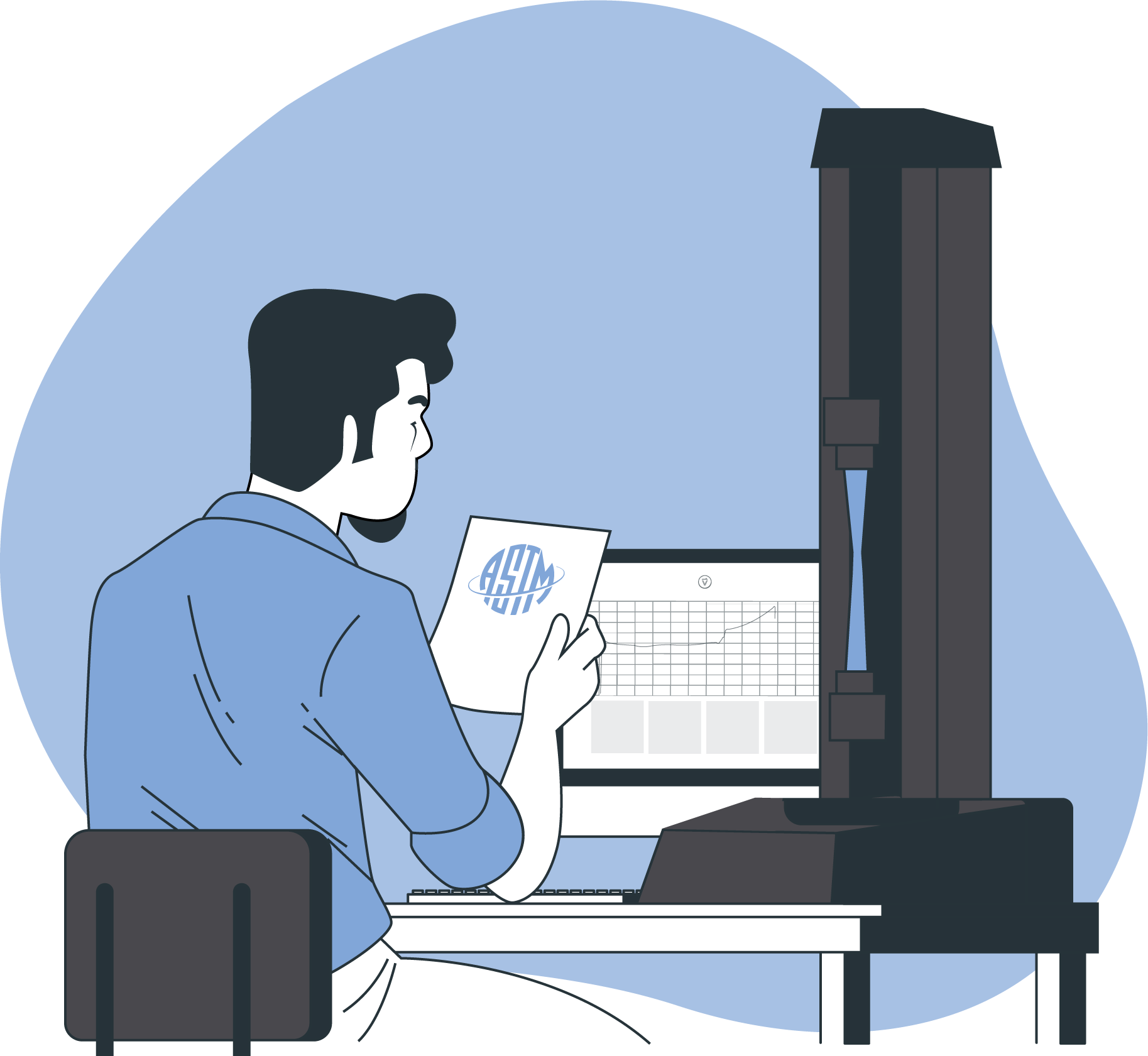
Project: Component design using illustrative techniques
This section covers the creation of components such as spot illustrations in marketing or web related assets. These don't always look impressive on their own, sometimes they do. There is something awesome about a well created icon. Most of the time they shine in context though. These components are often illustrative in nature. They are either the product of extreme abstraction or a more figurative rendering. They tend to be 'functional' in context as well as communicative. Even though this isn't necessarily the most impactful part of my portfolio, it is a very useful skill to be able to build these elements. At the bottom of this page you'll find an animated logo created from a logo I designed illustrating how context can radically change perception of elements.

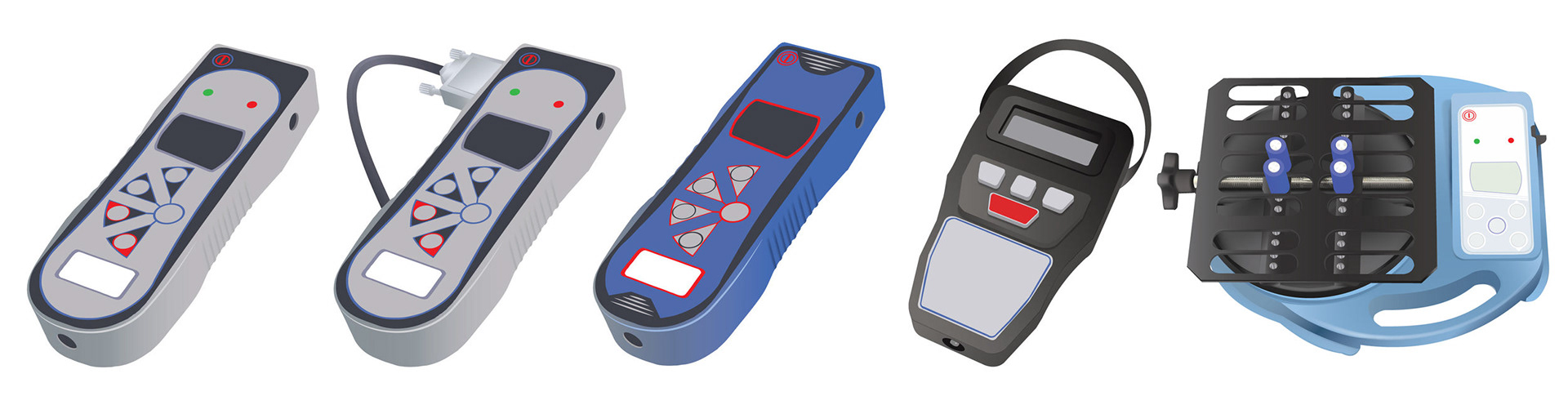
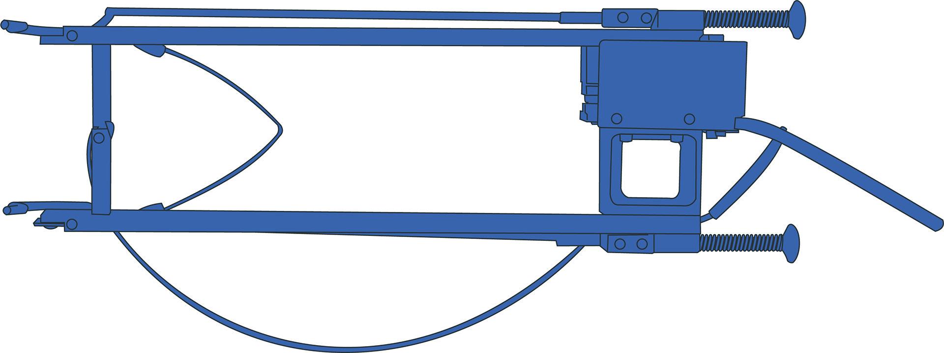
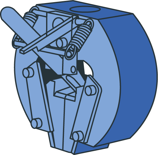
Left: Vector
The images on the left are vector renders of actual machines. They're built with shape and line in Illustrator.
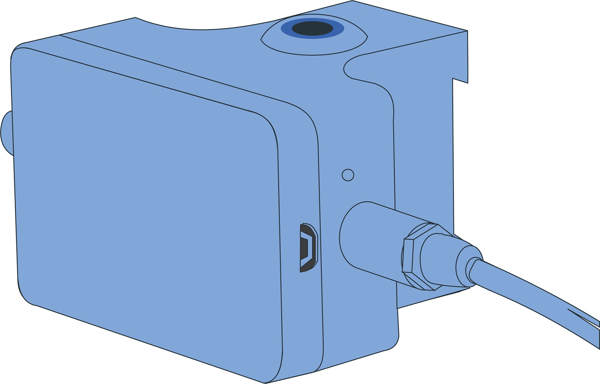
Right: Vector spot illustrations
These are some spot illustrations created for web and print publications. Built in Illustrator.