Project: Concept brand design, poster and website - URBAN WAVES
Type: Graphic Design, Visual design (UX/UI)
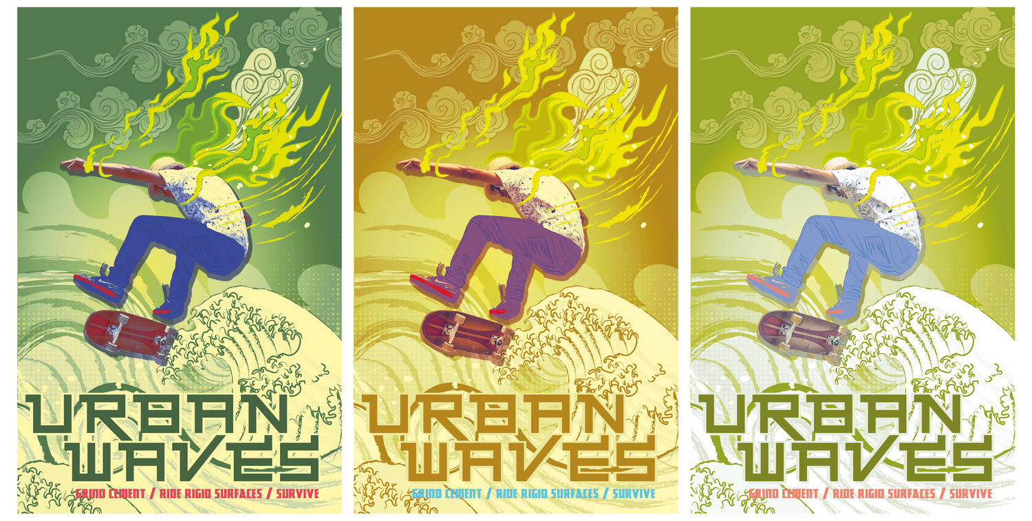
This is a conceptual design project for a skateboard shop and website called Urban waves. It refers to concrete and rigid surfaces. I worked on artwork for the project, illustrations plus visual design for the website. It's thematic use of colour lemony summer and sports some tones of Californian chic.

The posters mix in letterforms, cut out and manipulated photos plus vector shapes. These form a digital mixed media which reflects the cultural viewpoint of the target audience. Different colour combinations are built from the style-guide.
Urban Waves website
The design of this mid-fidelity prototype and design was carried out within XD.

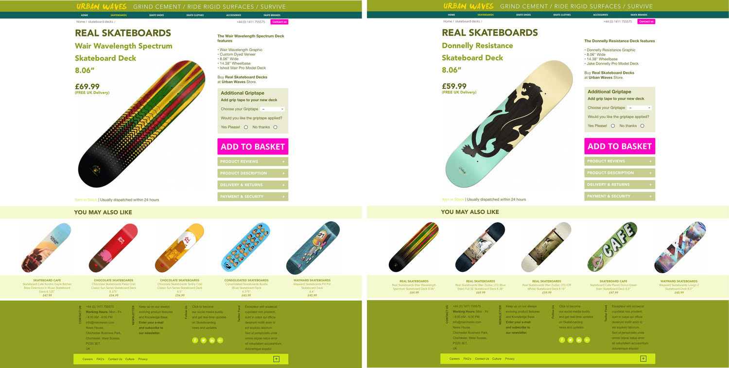
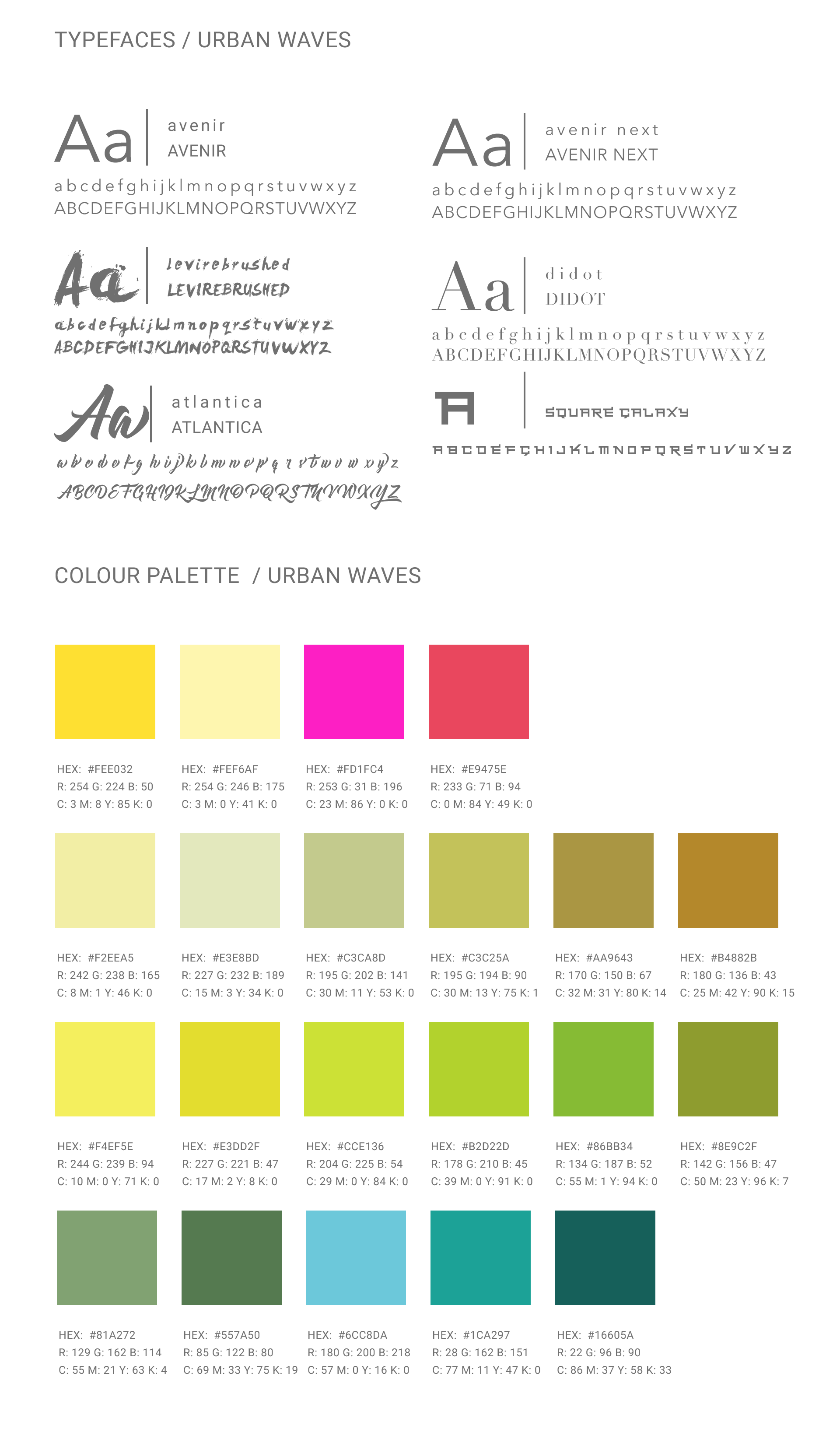
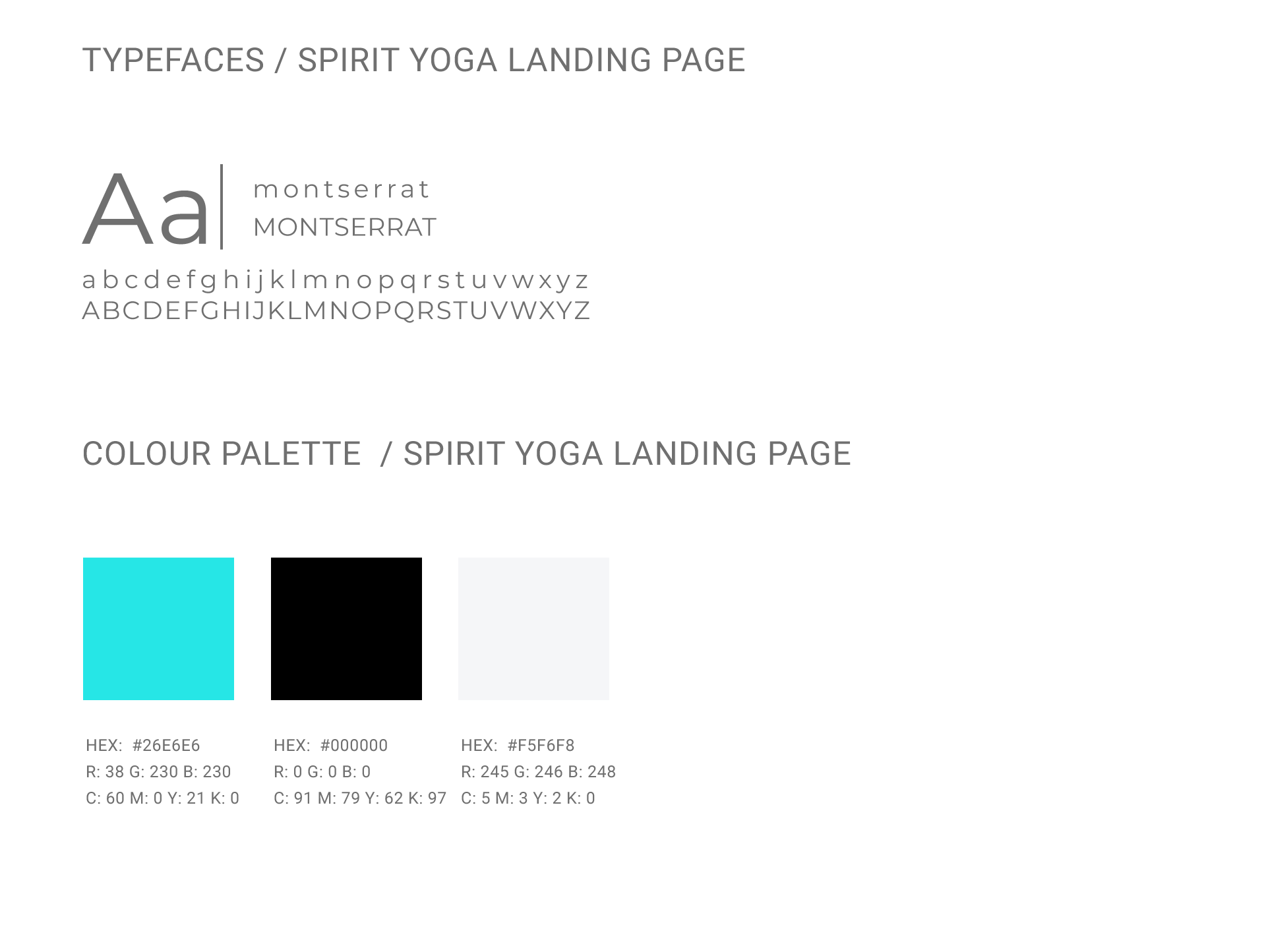
Every project has styleguides affording a visual space for the designer to work within. Some basic details of the Urban Waves style is displayed to the right. These are typefaces and colour palettes mainly. A more extensive style guide will give guidance on typeface weights and sizes, etc.
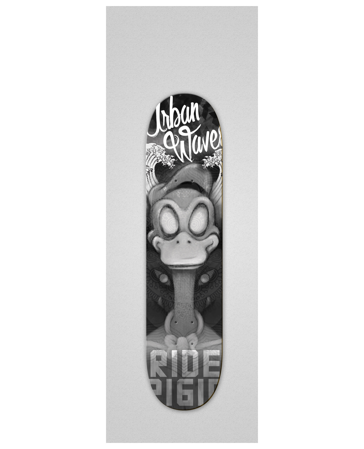
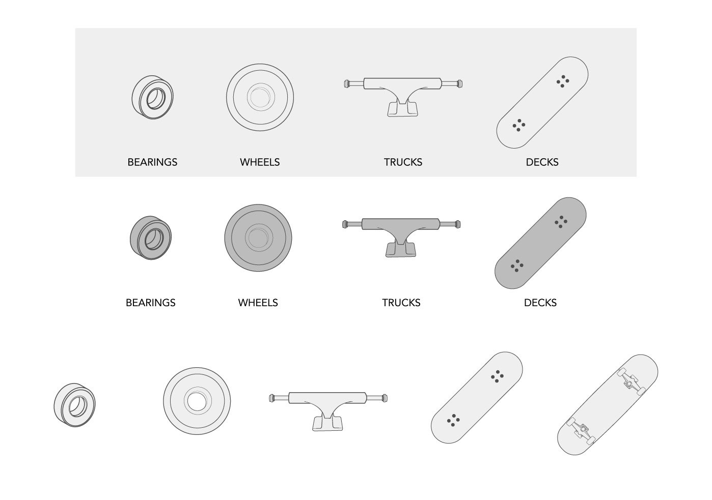
Below are examples of some of some UI elements and a branded skateboard design. The UI elements are for use in a product finder/board builder function on the website. Where the user is afforded the ability to select board components or a whole pre-built board.
Project: Email and Landing page design - Spirit Yoga
Type: Graphic & Digital Design, Visual design (UX/UI)
Whether built within a marketing platform such as Hubspot or coded it is important more than ever to make sure that emails and their corresponding landing pages are as impactful and as engaging as possible.
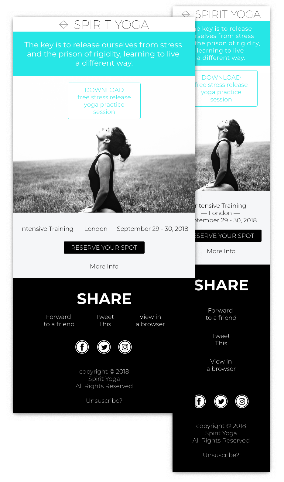
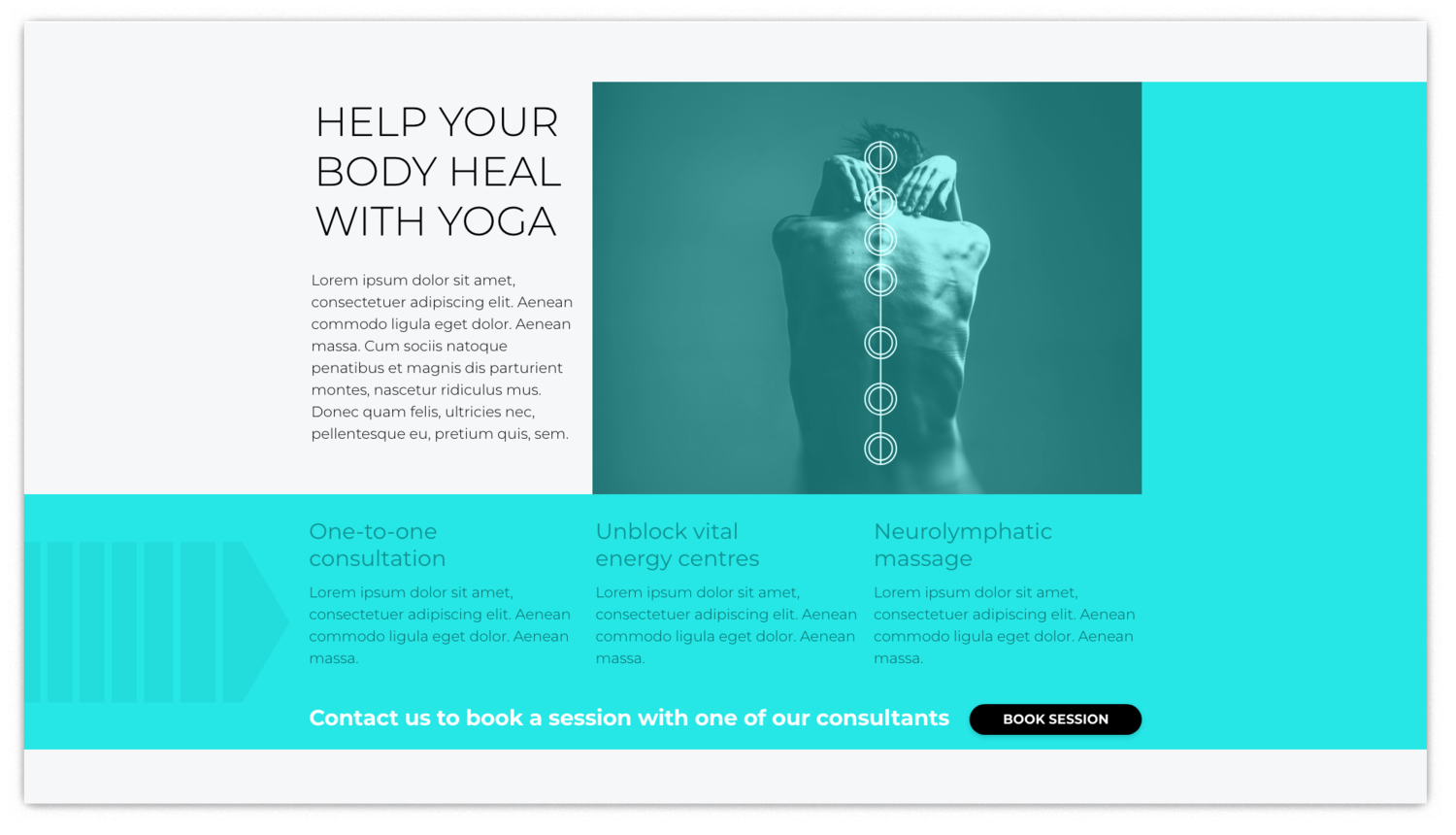
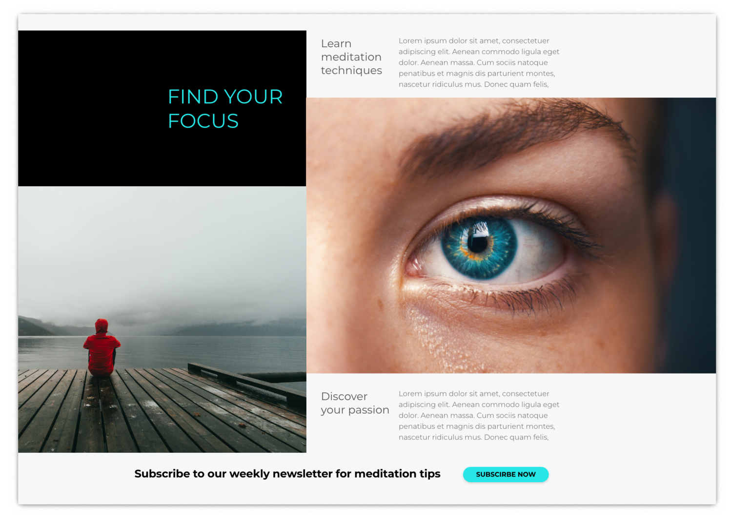
Below are the landing pages that go with the email design above. You'll notice that messaging and visual design in the email are reflected in the landing page. The screenshots below represent different sections within the page.


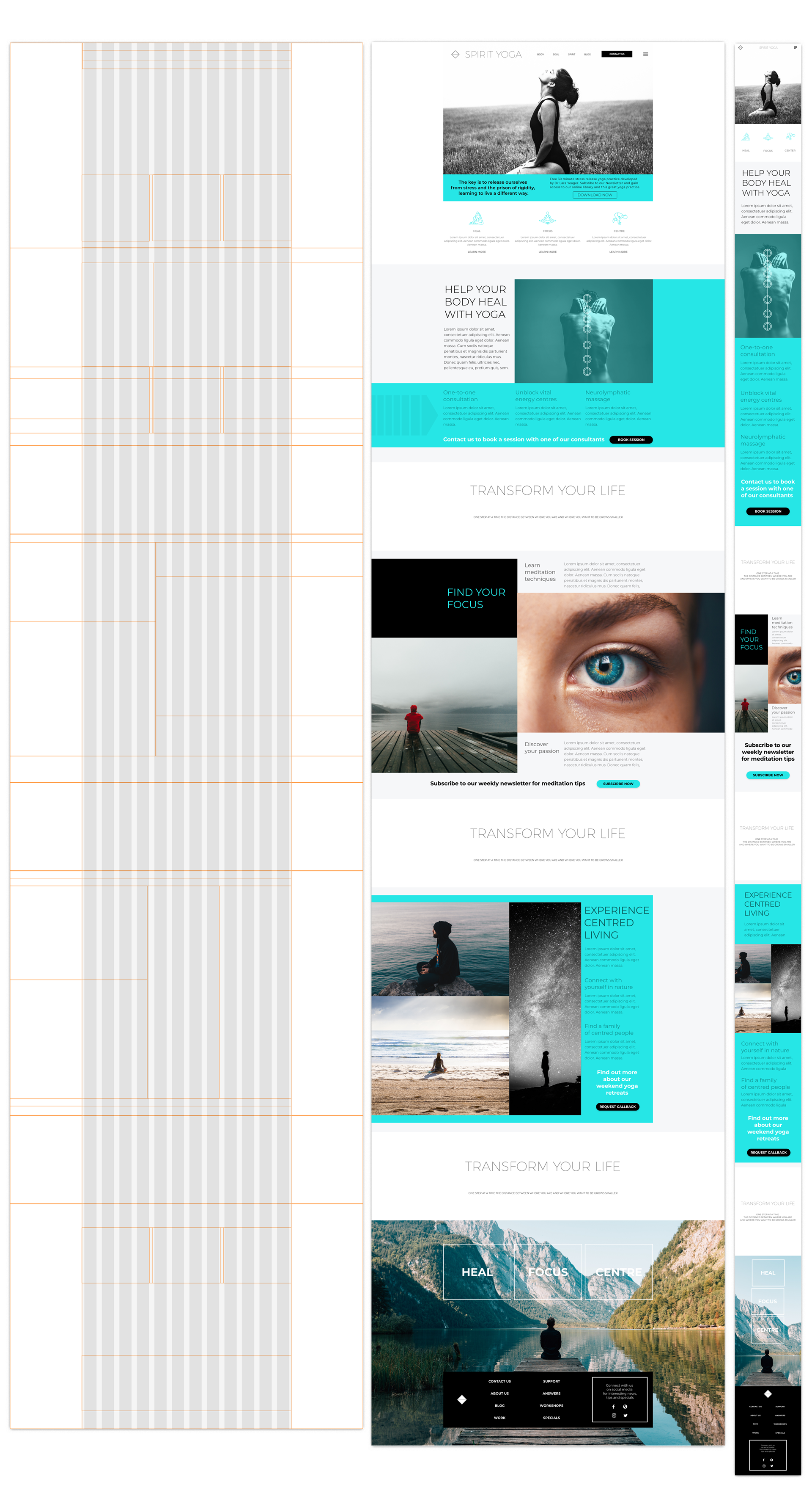
Below we have the grid structure I created and used for the landing page and a basic style guide for the email and landing page design.
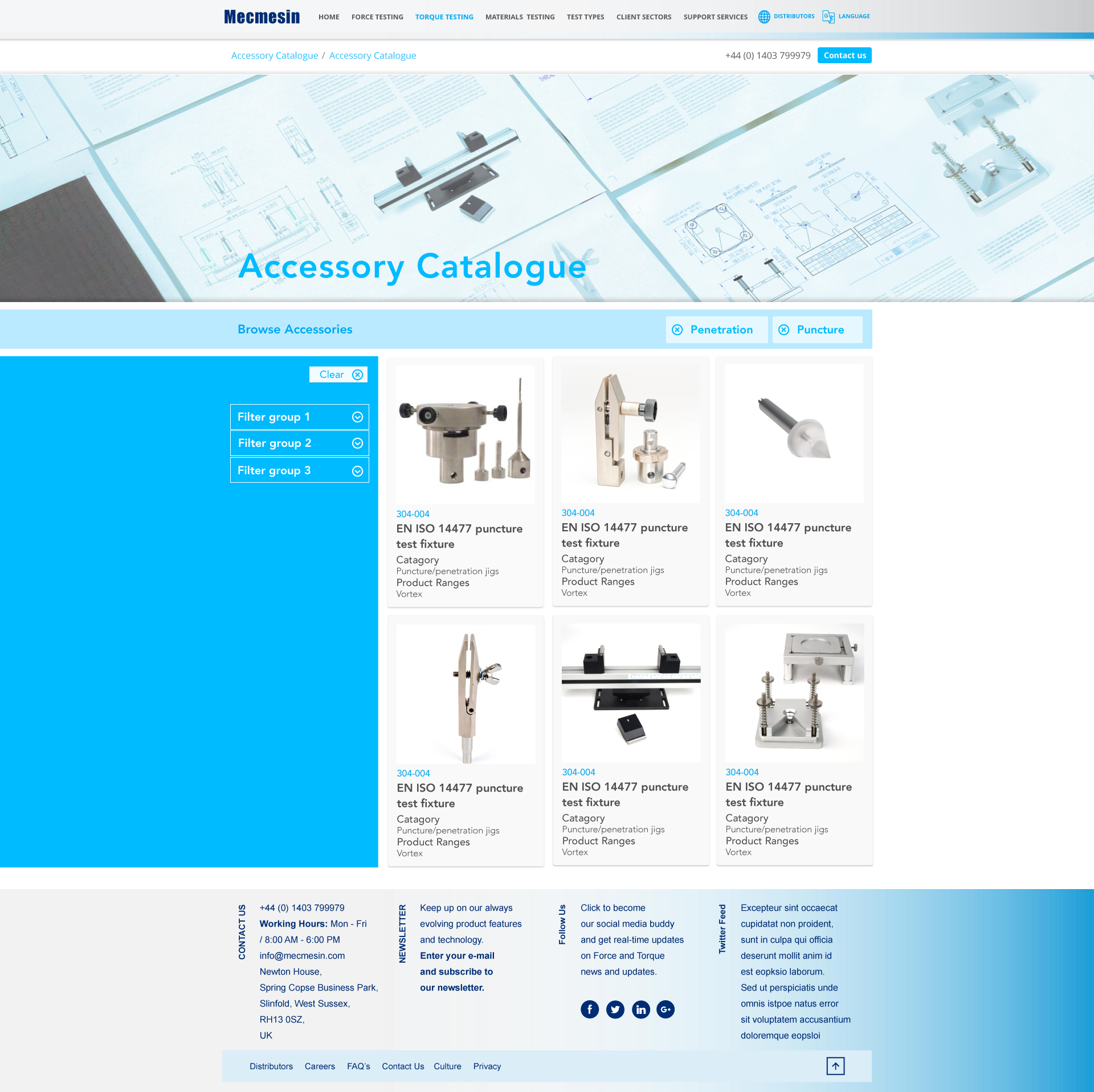
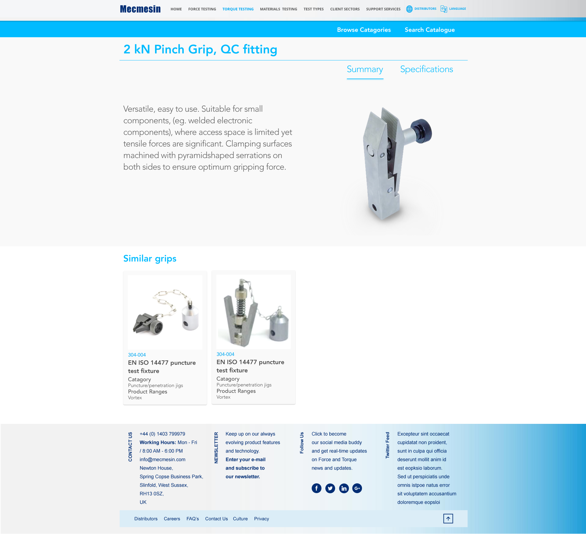
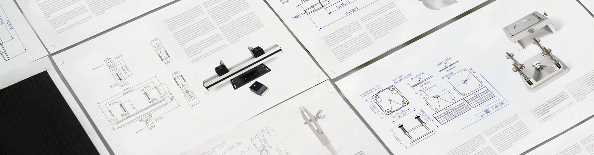
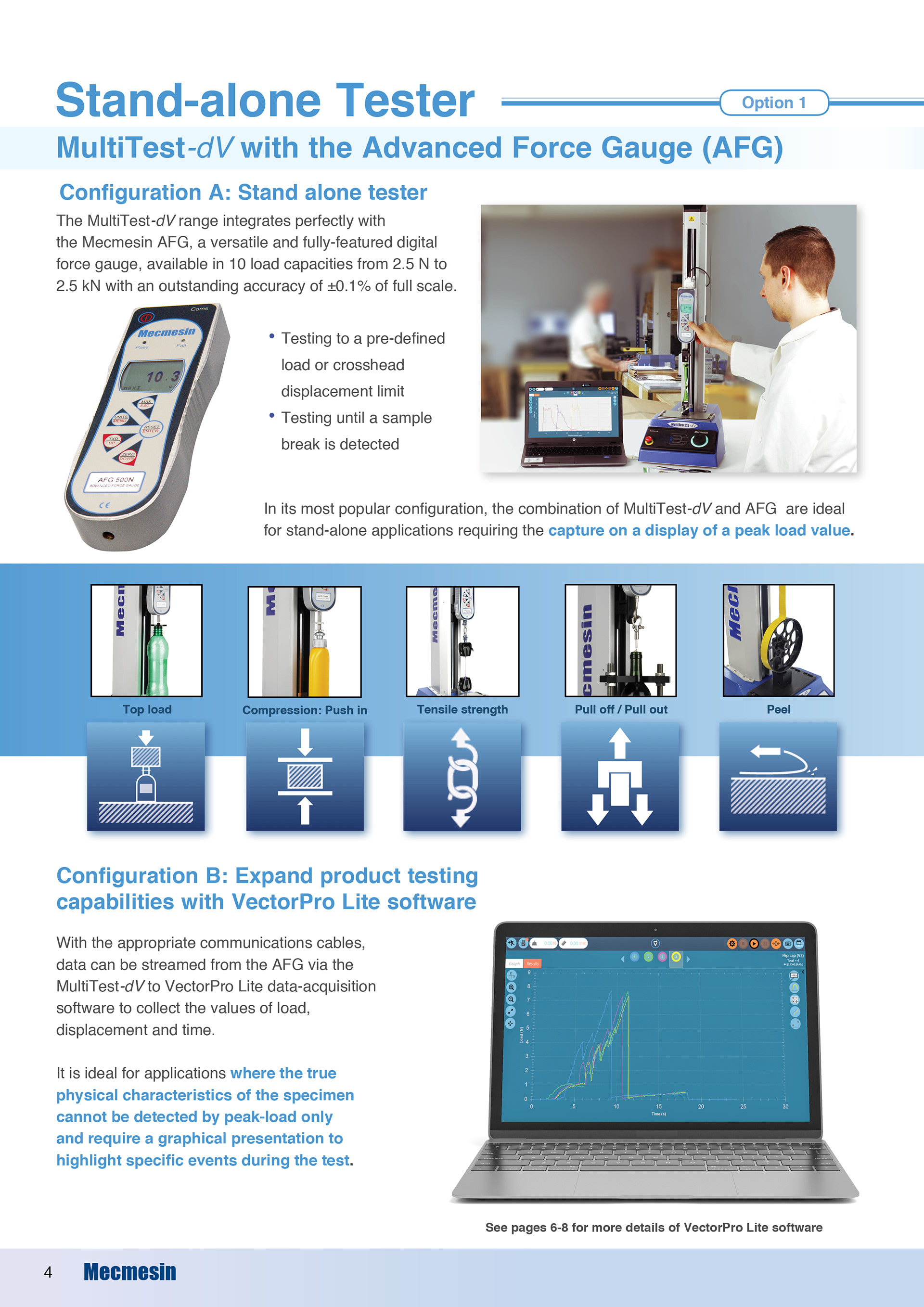
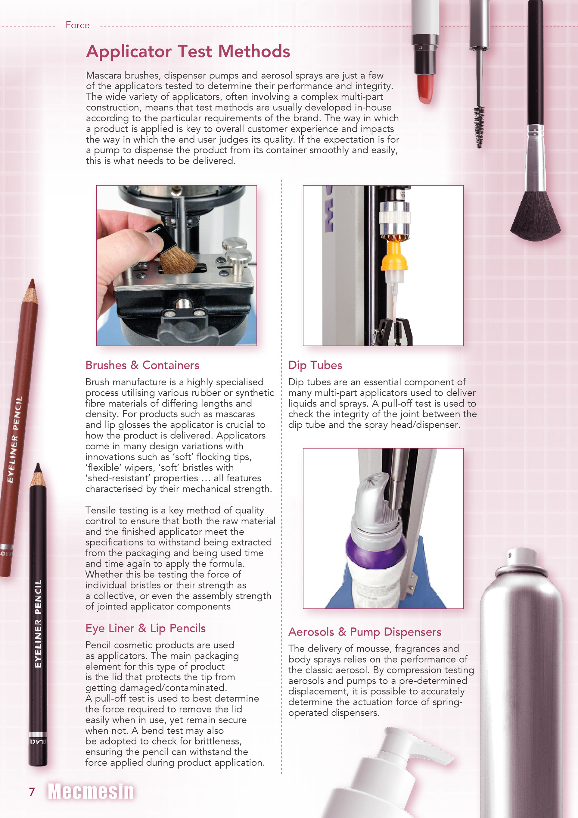
Project: Concept brand design, Visual Design - Mecmesin web accessories catalogue
Type: Visual design (UX/UI), graphic design
The prototype was built within XD for handing off to the dev team. This was a monumental shift forward in terms of UX and Visual design from the precious web pages.
Below are specifications tables mirroring the print equivalent data sheets. We used a tab system to organise different sections.


Project: Re-designing Mecmesin Website and re-branding web assets
Type: Graphic & Digital Design, Visual design (UX/UI)
This was a site design which took in very complex structures filled with lots of important content. The idea was to break down this content into a visual format which made it easier and more engaging for users to discover and interact with the content. The examples below were starting points on the iterative journey. These are low to mid-fidelity prototypes built in XD. The prototype allowed us to investigate some of the basic interactions and user journey plus develop the visual language of the brand. It was as much a re-branding exercise as a web development project.
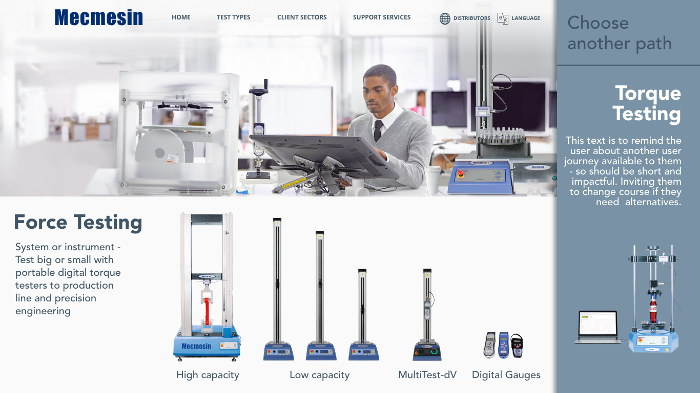


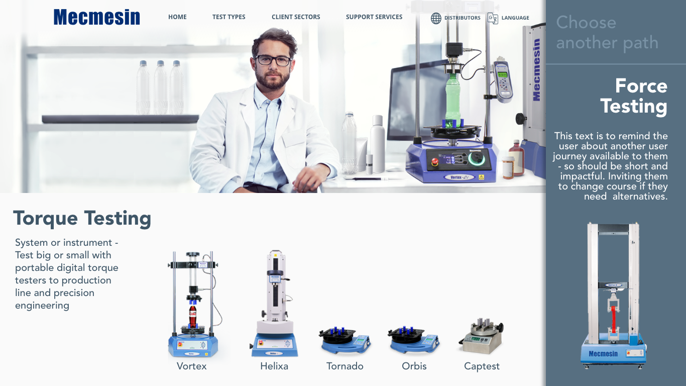
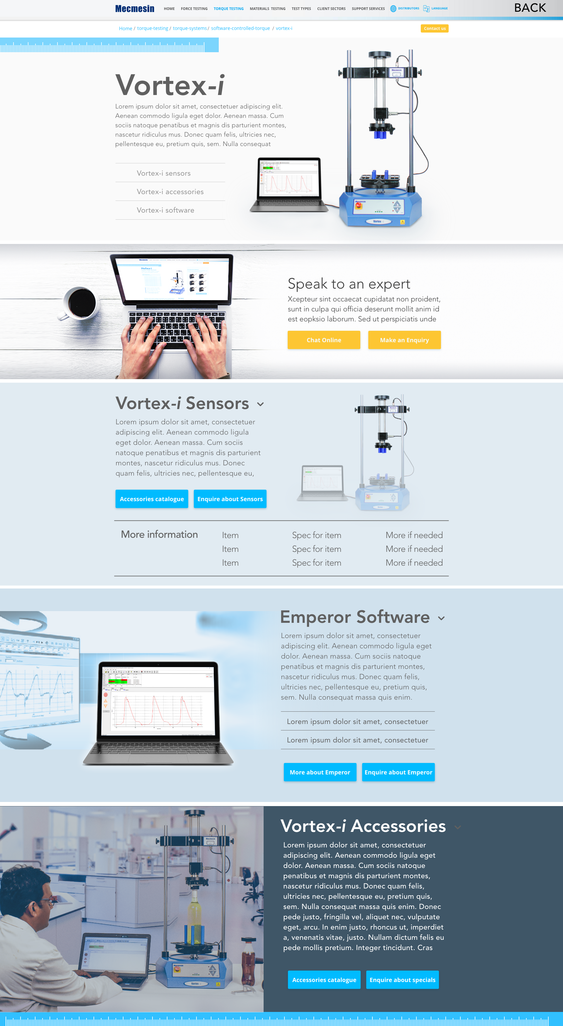
Below we have images of the product page in process of being designed. These are low to mid-fidelity examples of these pages. Bearing in mind that what would appear above the fold might be about 1/3 or 1/4 of the image depending. Here the whole height is presented for ease of showing the design. There is also a shot of a component in development - again, these are mid-fidelity examples. The decision was made to take the design of these pages to a mid-fidelity point and then being developing the results in Drupal. This was due to the content writers having to fill up the site via Drupal. Any further refinements were done directly with the senior developer and myself or at times we would revert back to XD if more intensive refinements were needed.
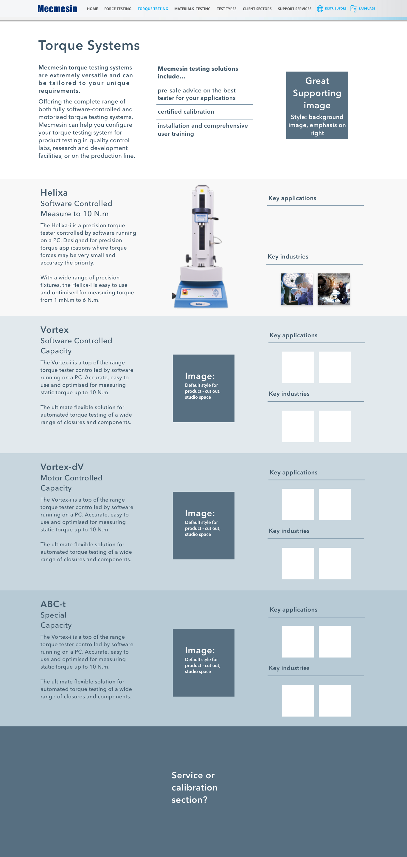
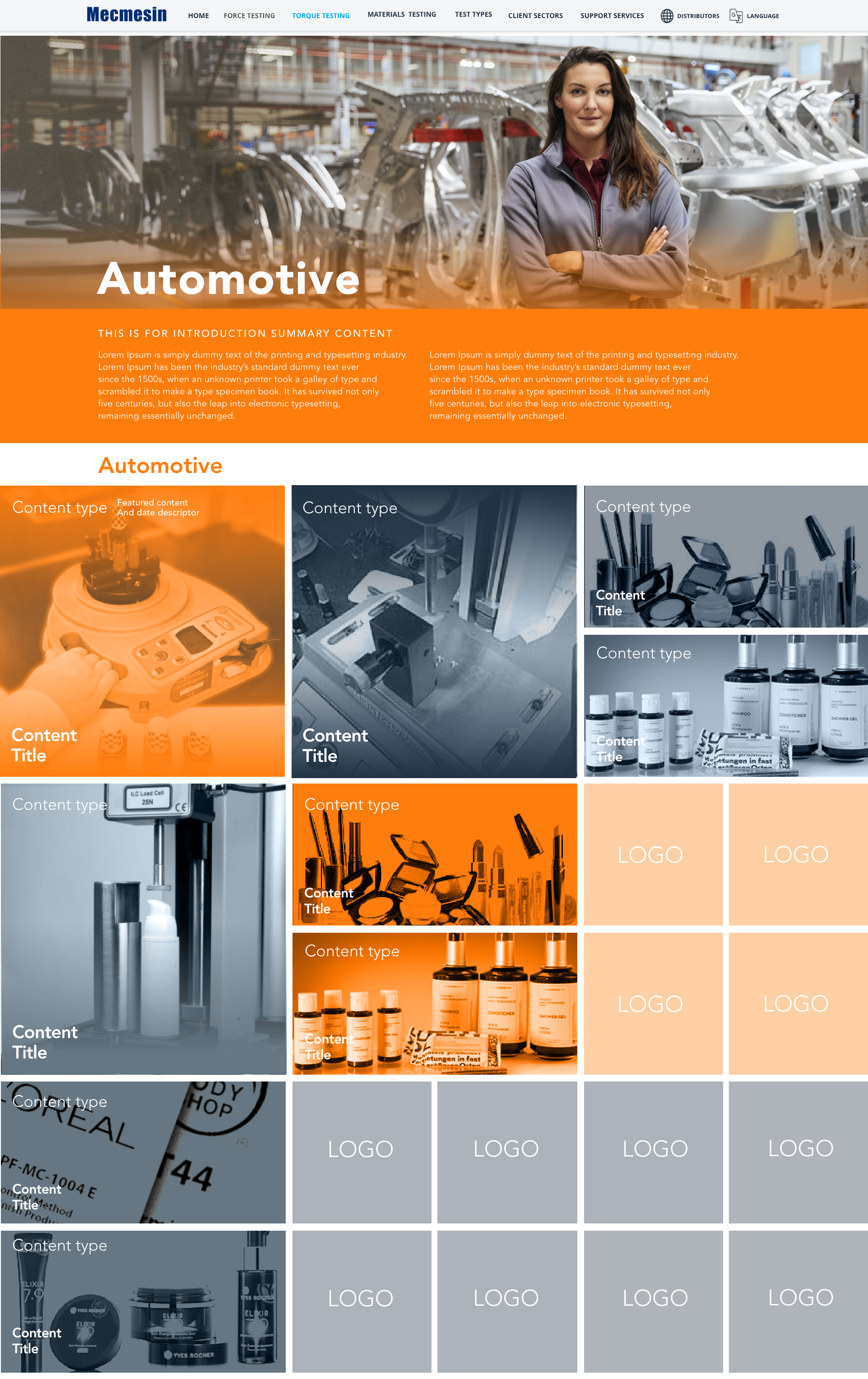
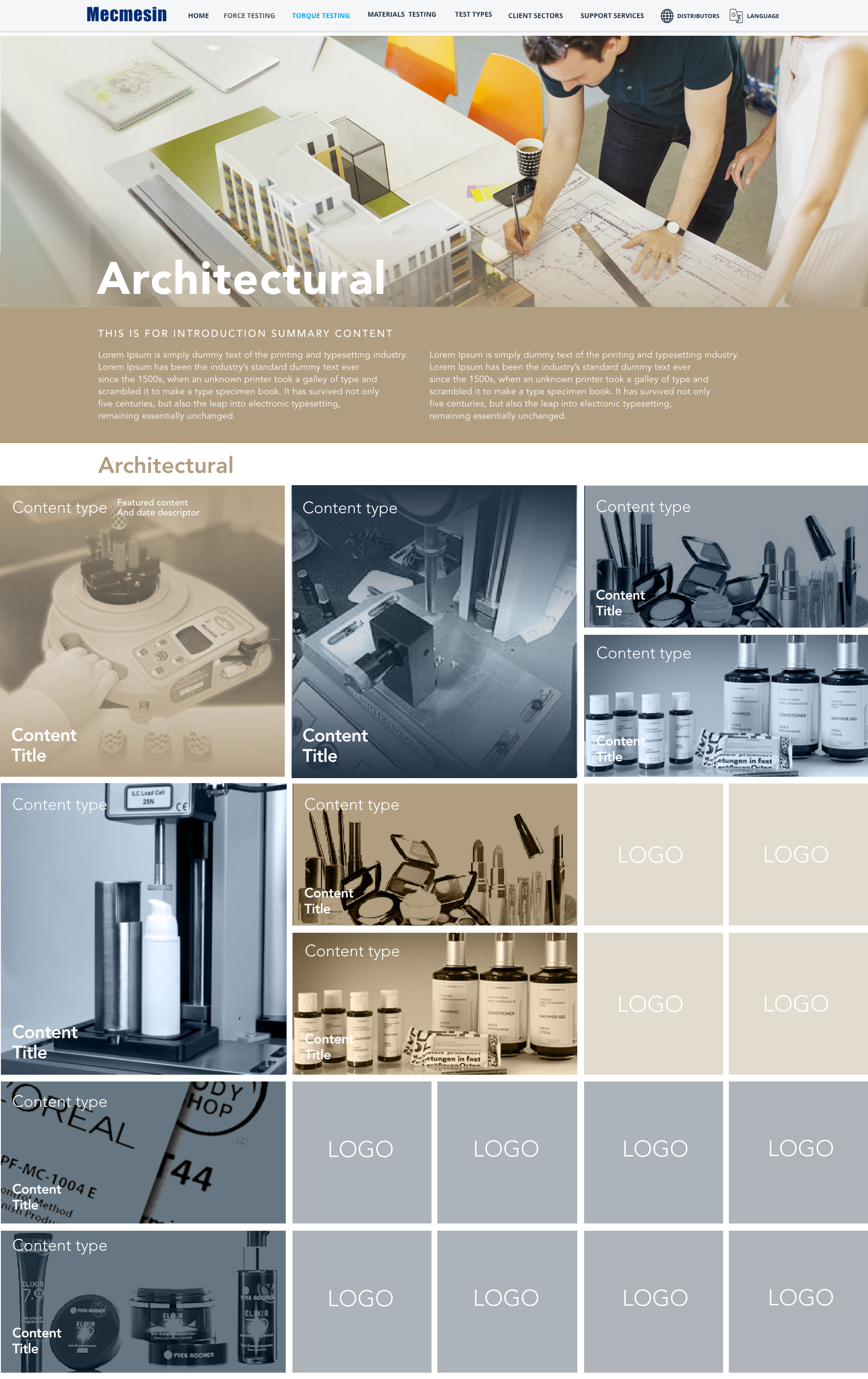
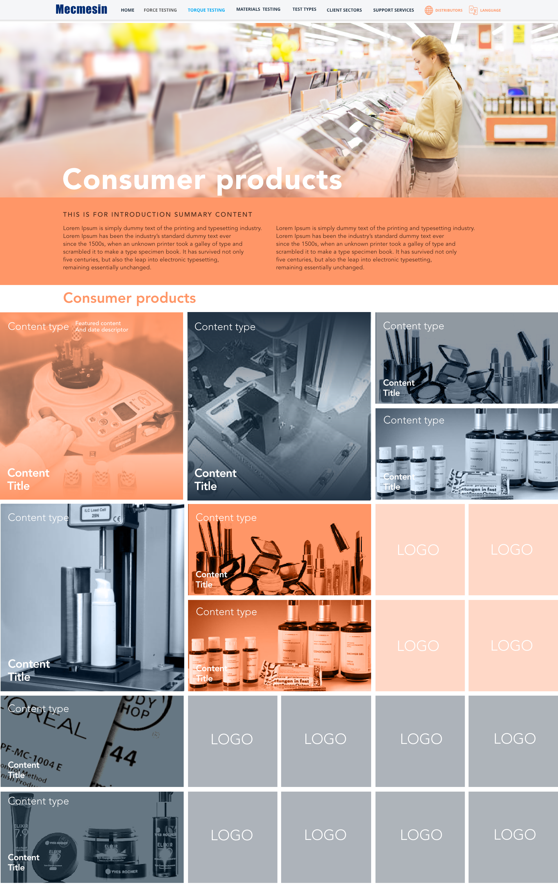
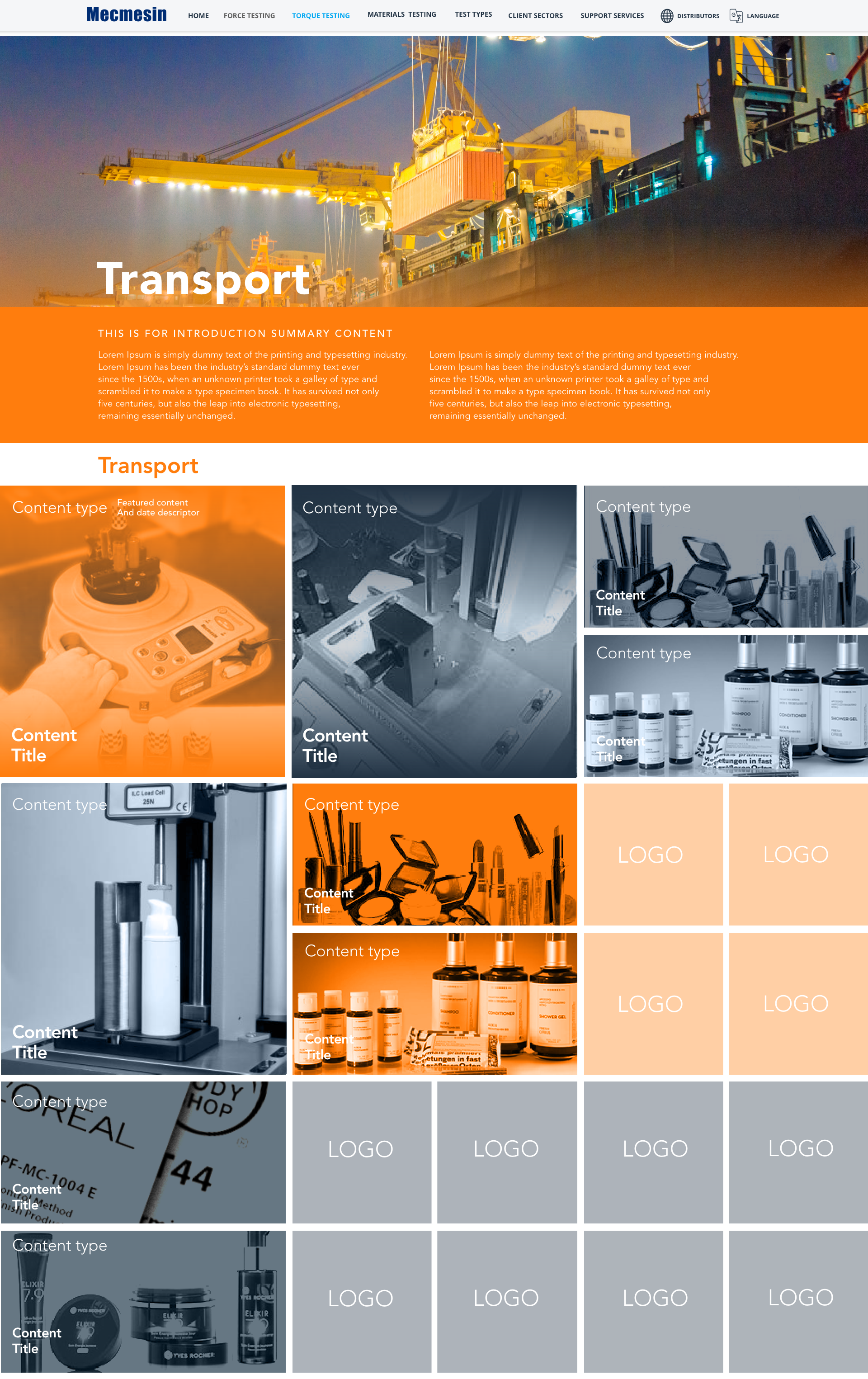
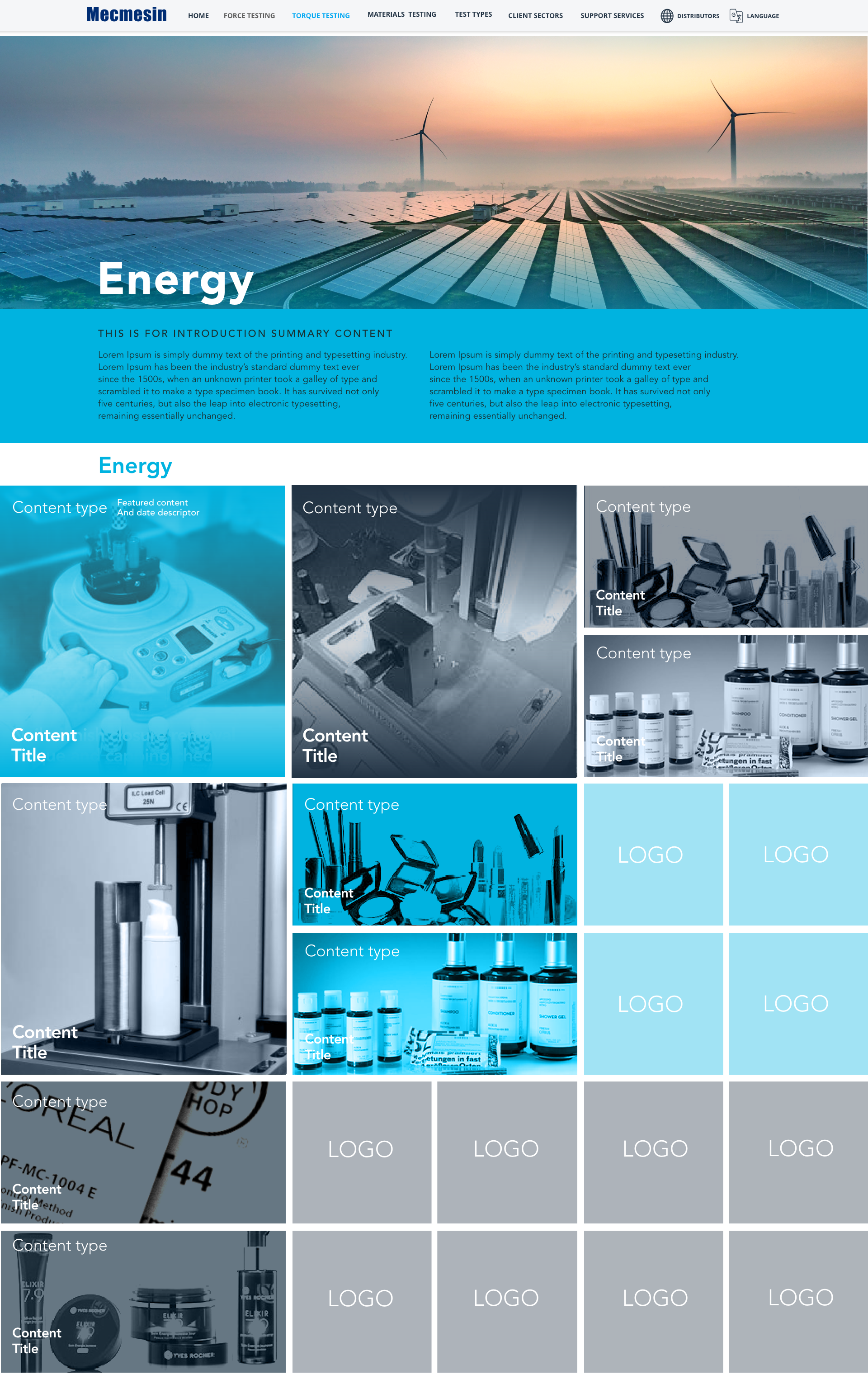
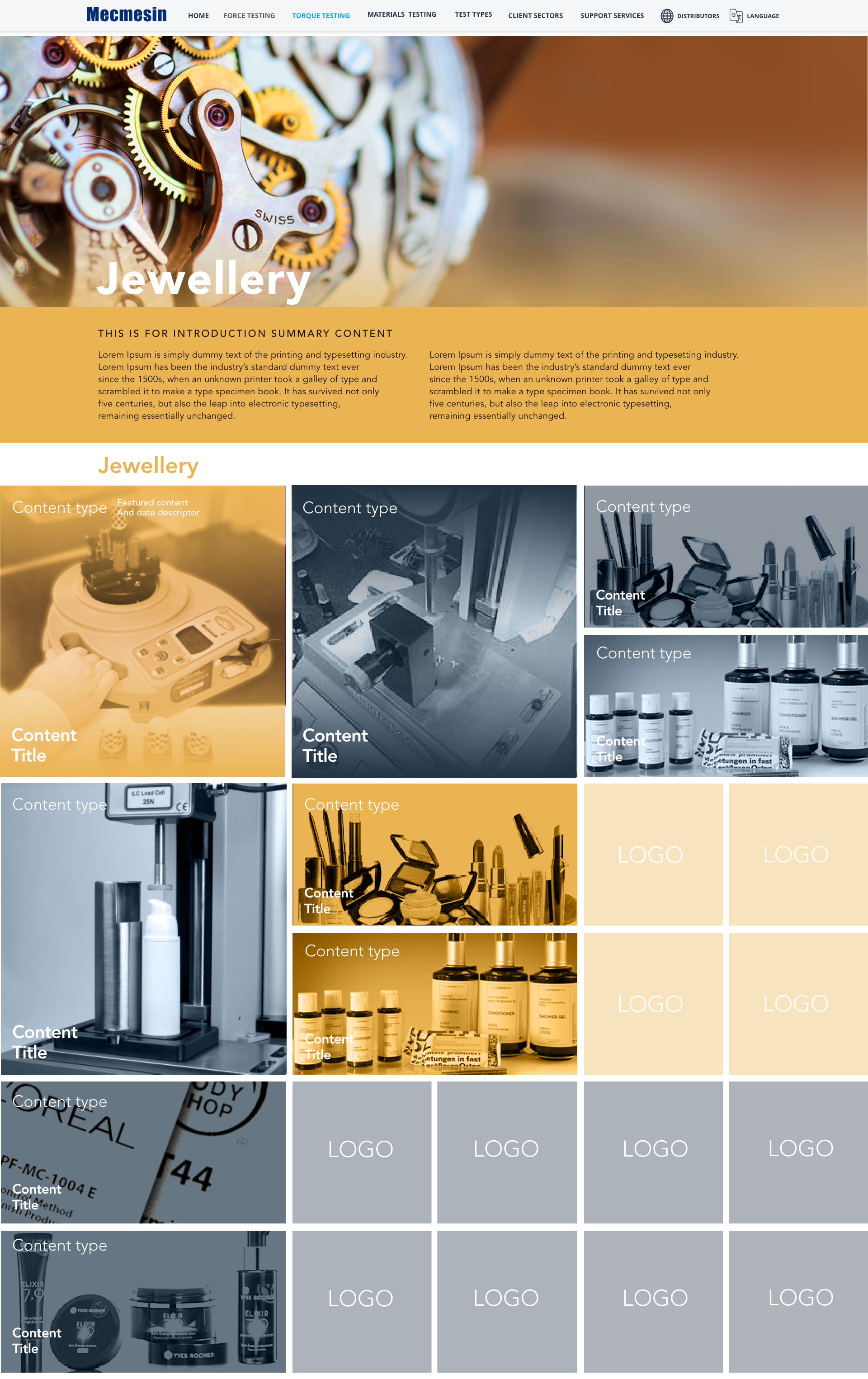
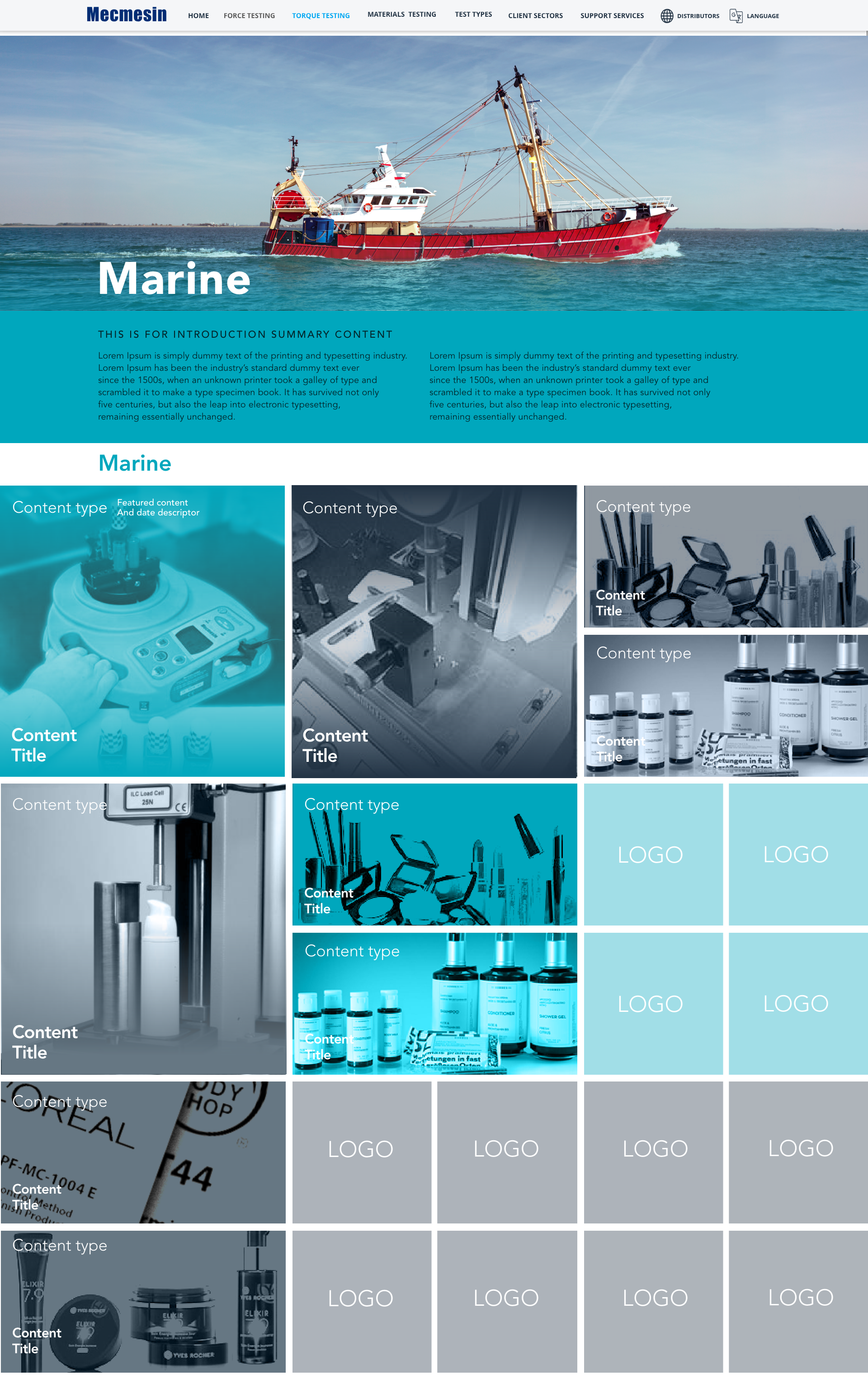
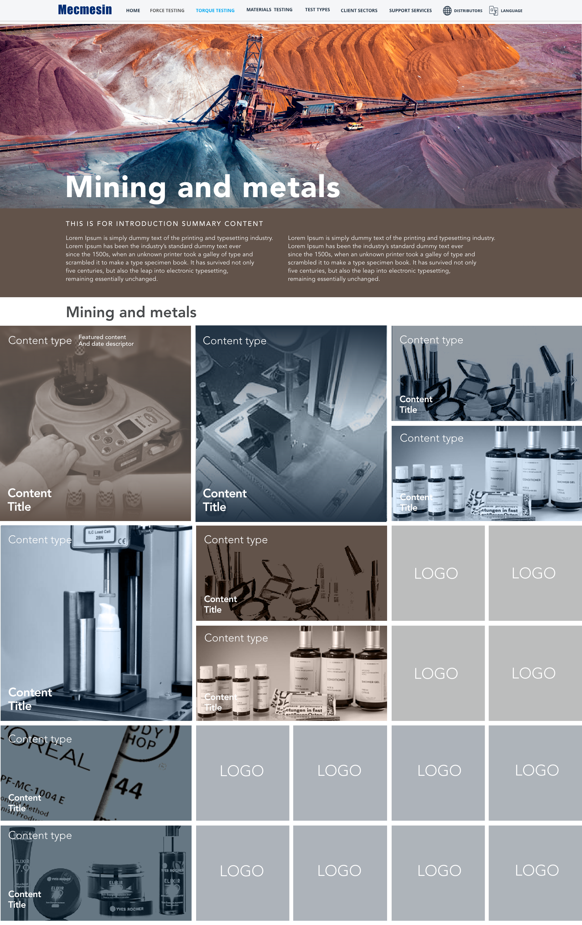
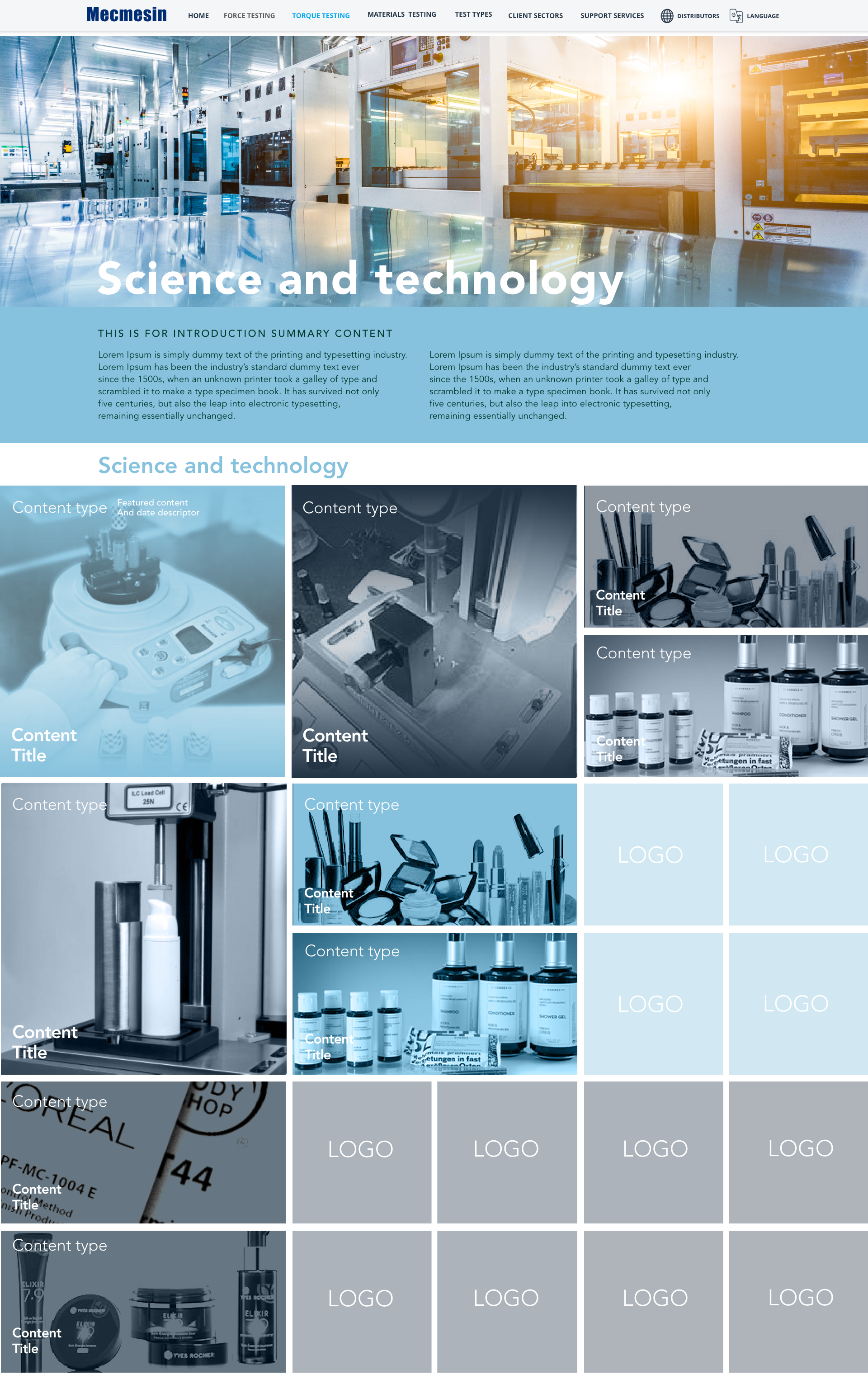
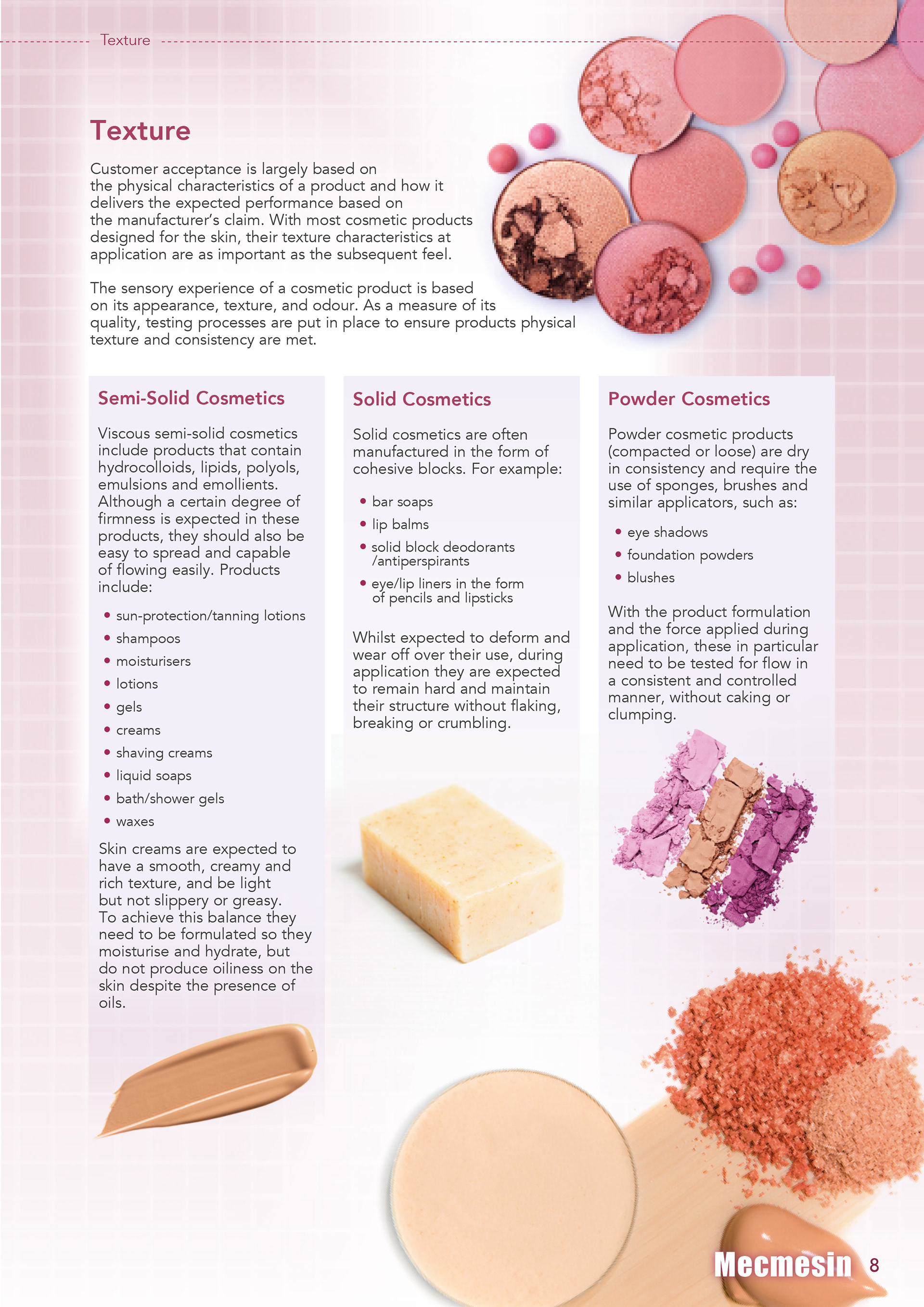
As the website project developed we had laid in the basic framework of the site and started reaching parts of the site which were very important but worked differently to the rest of the site. This section worked along the lines of Content Marketing and needed to allow the user to explore the extensive database of case studies the company had developed. These were organised along the line of key industries. Each industry having x amount of case studies to be explored and these would in turn point the user back to an associated solution for that industry and application within the core site. To the right is a basic breakdown of the style guide for components and colours used in the industry section. We debated going down the route of psychology of colour for our colour choices but in the end decided to be more emotive and pragmatic with our colour choices. Below are the low to mid-fidelity designs and prototype for each industry. It was important to create impact and engagement since most of the content imagery was a little lack-lustre though very useful.


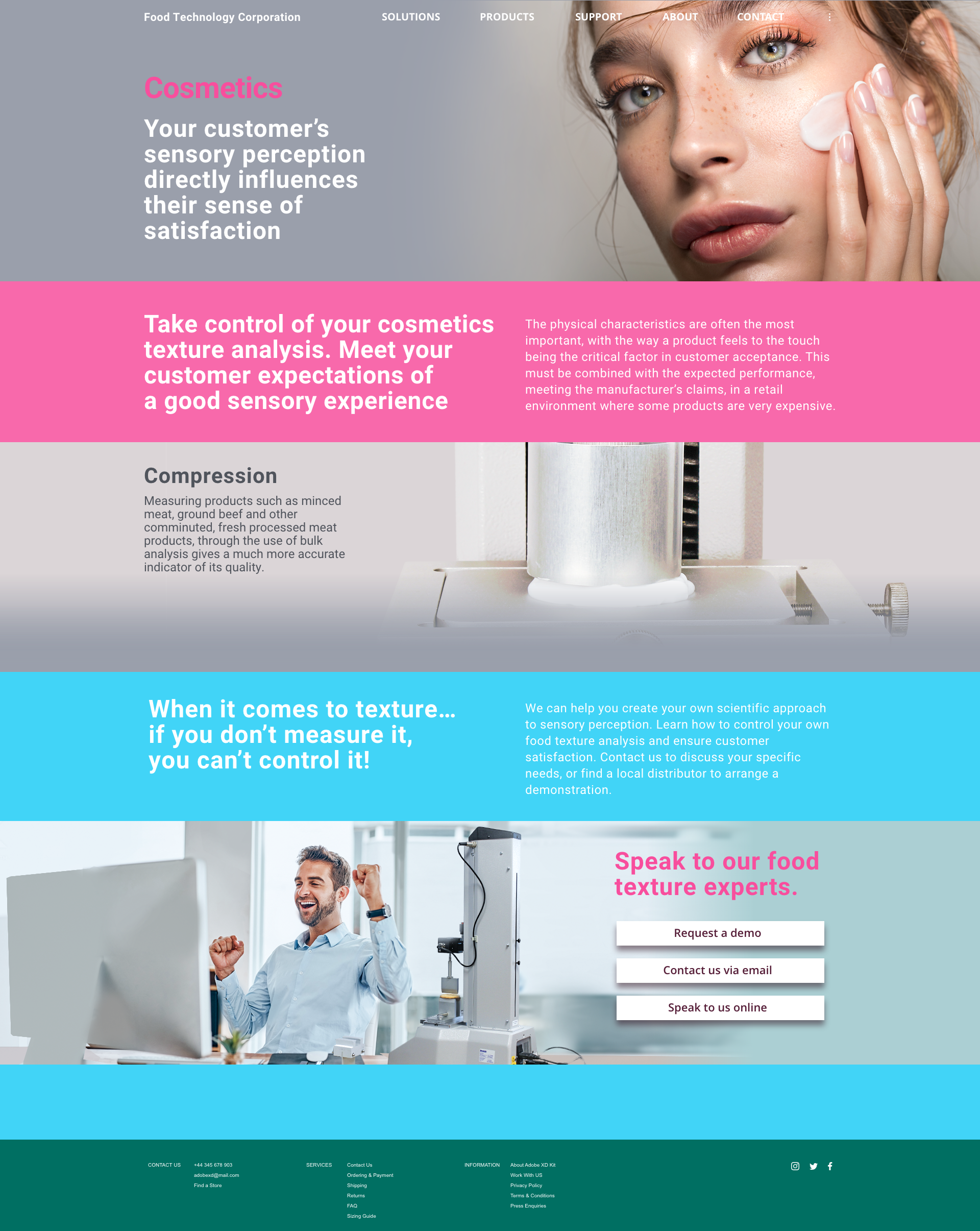
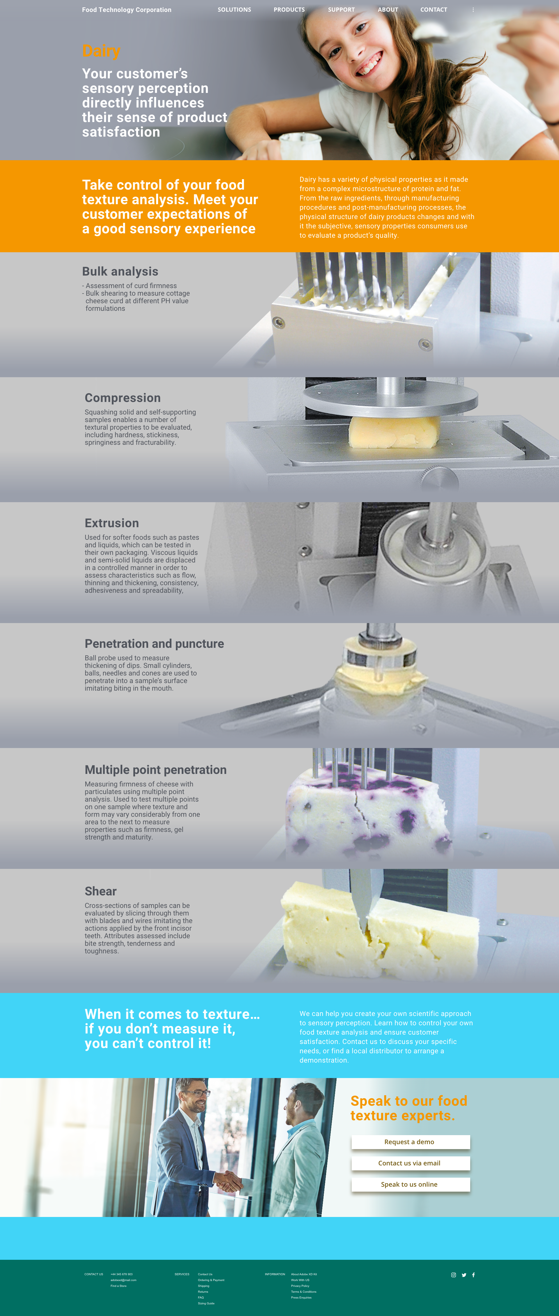
The project entered a third and fourth stage with the development of 'micro' sites or satellite sites which dealt with specialisms within the market. One such area was texture measurement. Here we discussed how users were looking for solutions rather than just a product. I wanted the visual impact to emphasis the sensory aspect of the message. I wanted the focus of the message to be on how the solution lead to expected sensory results in the market and that this was science based exploration provided by the solutions explored in the site. The images on the right are snap shots of these concepts and were used as a kick-off point for the project.

Project: Various Marketing design projects
Type: Graphic Design, design for print and digital
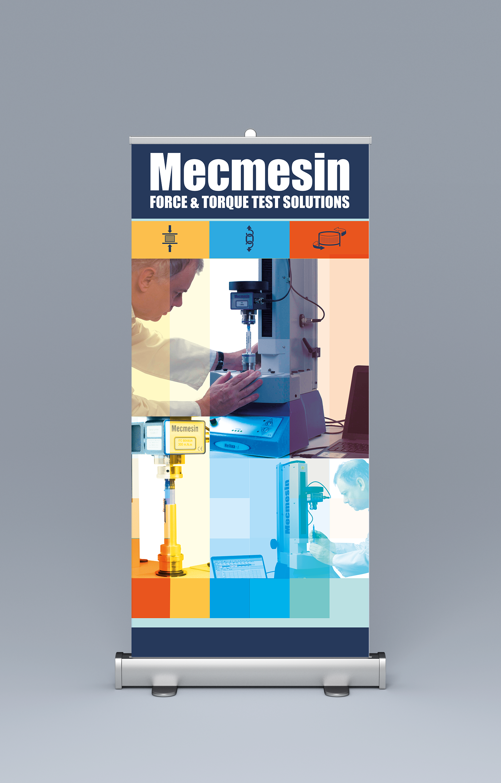
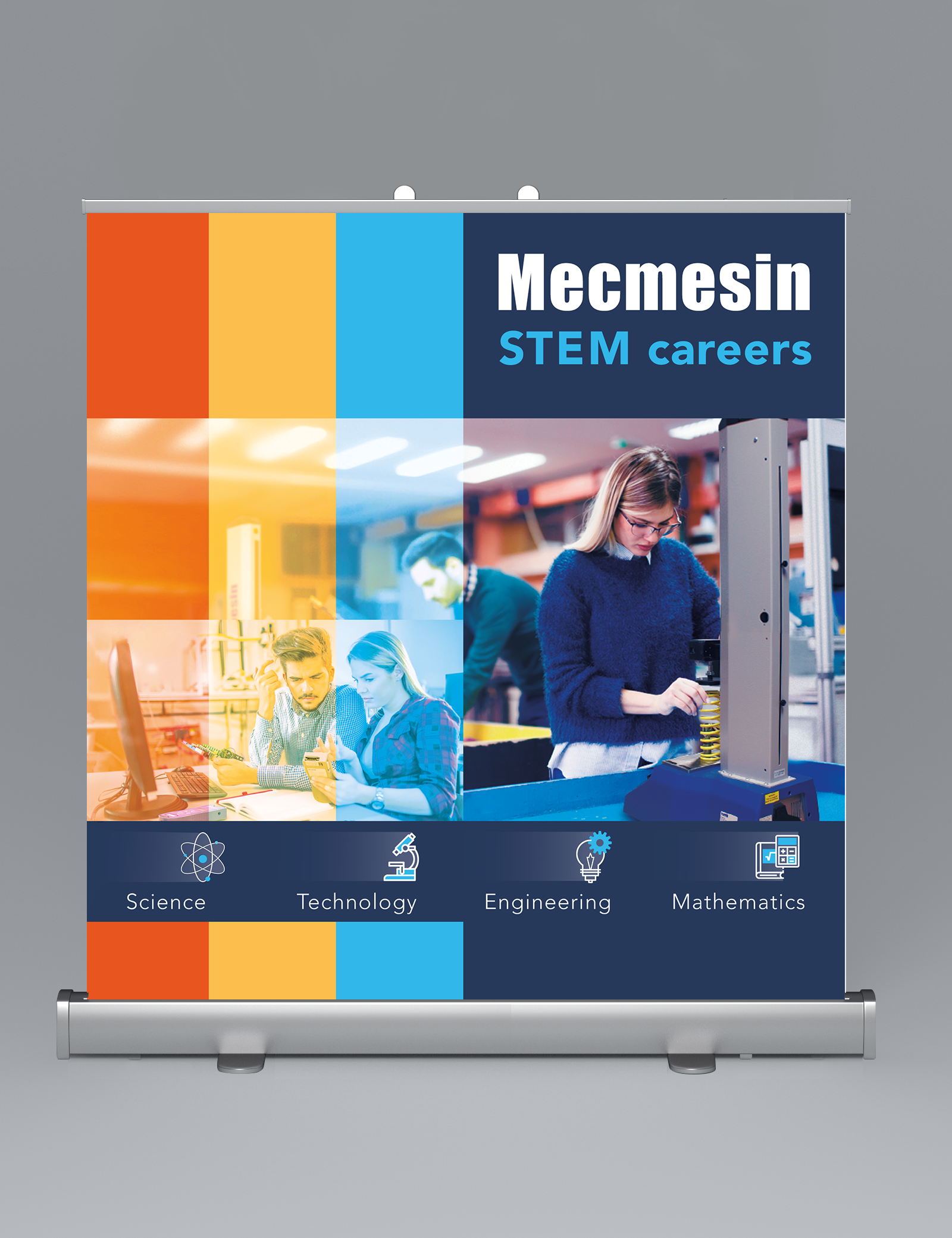
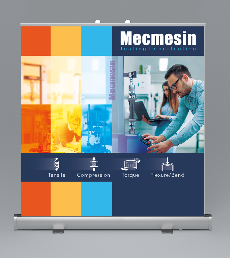
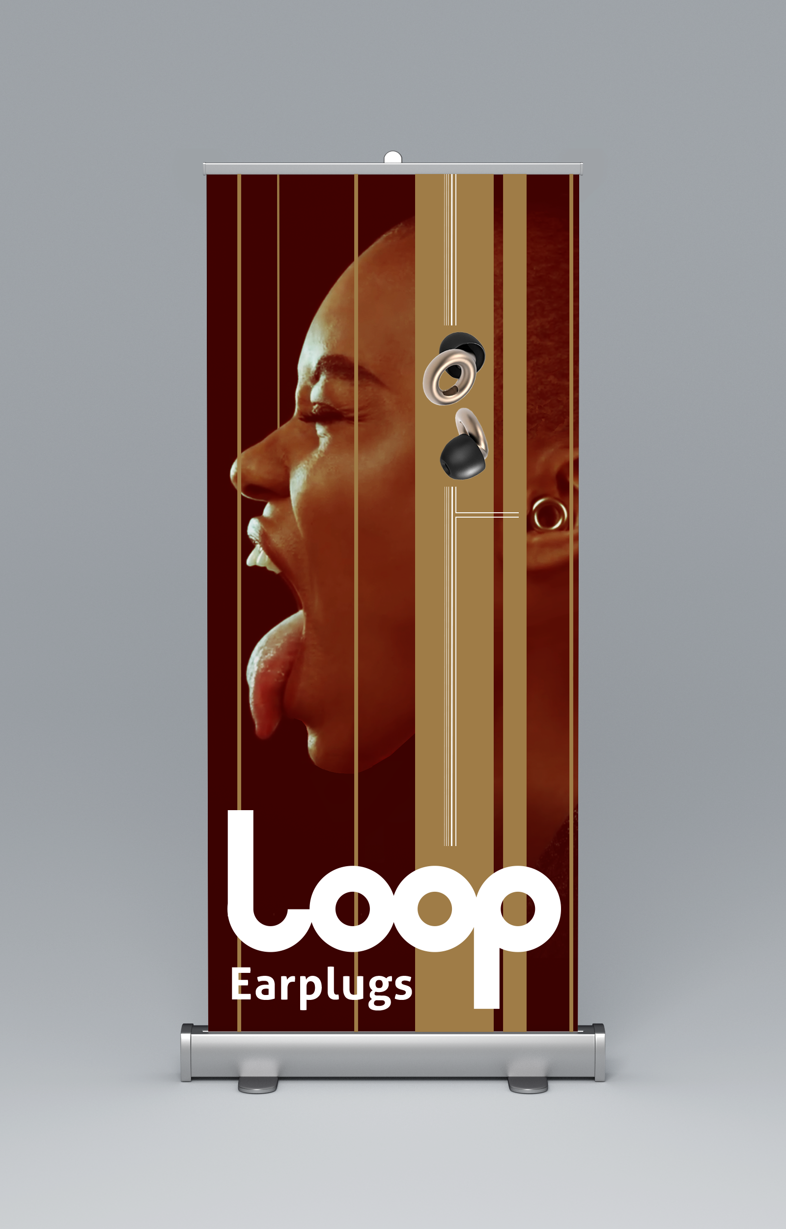
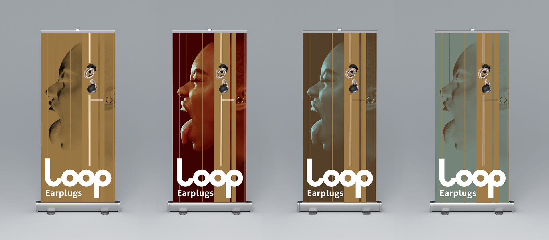
This section is a collection of marketing design assets. The first one is a roller banner design I did for an interview test. I liked the result so kept it for my portfolio.
Type: Brochures, print and digital
These are some shots of brochure page designs. Layout, typeface use and so on.
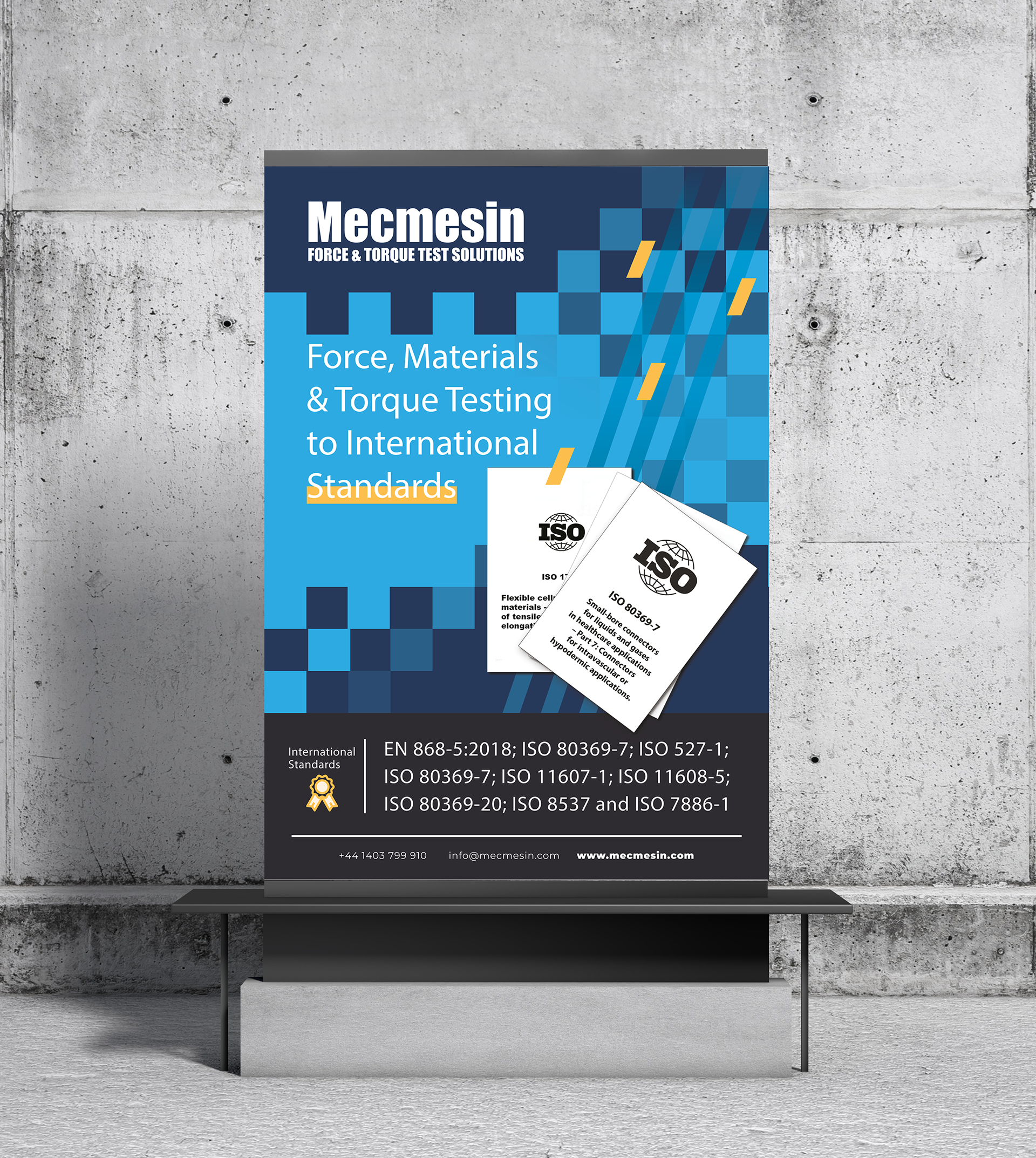
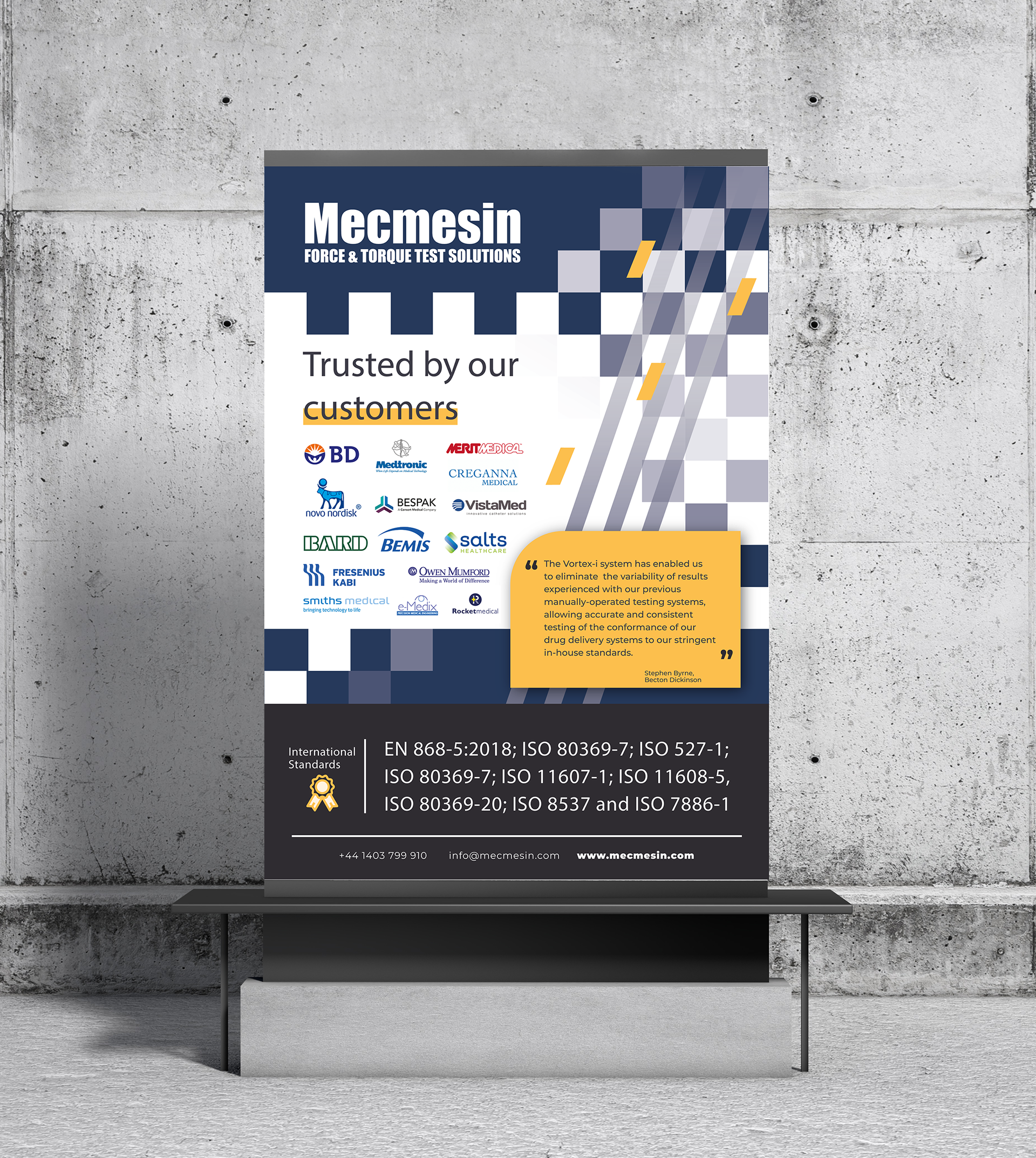
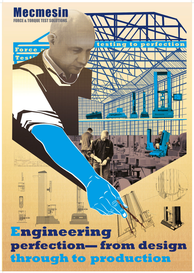
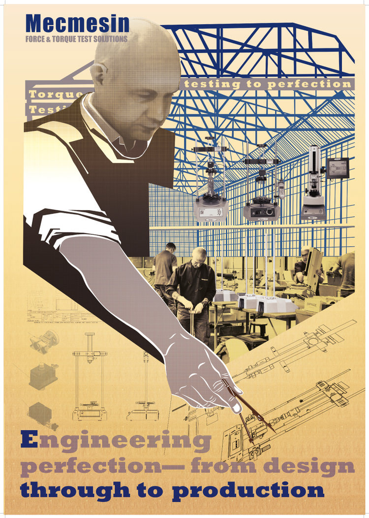
Type: Posters and banners
Posters and banners are larger formats. Most businesses make the mistake of trying to convey too much. Communication should be more direct and as simple as possible. It is better the for the designer to communicate a sense of layers to how marketing assets or indeed design assets are organised. Posters and banners are hooks, they quickly convey the brand and an element of interest. They draw people closer and begin the engagement process. This leads to the next layer and then the next until at some point in the journey the target audience is presented with a decision, a response to make to a call to action. The target audience should be comfortable to make that decision at that stage.